Web Design Trends to Watch in 2021

Each year’s web design trends provide an opportunity to take a closer look at patterns developing and improve the way people experience your organization’s website. As we reflect on a year full of challenges, we take a closer look at the current and upcoming web design trends that are making a major impact in the online world of healthcare and when to apply them.

Minimalism

Examples of minimalism

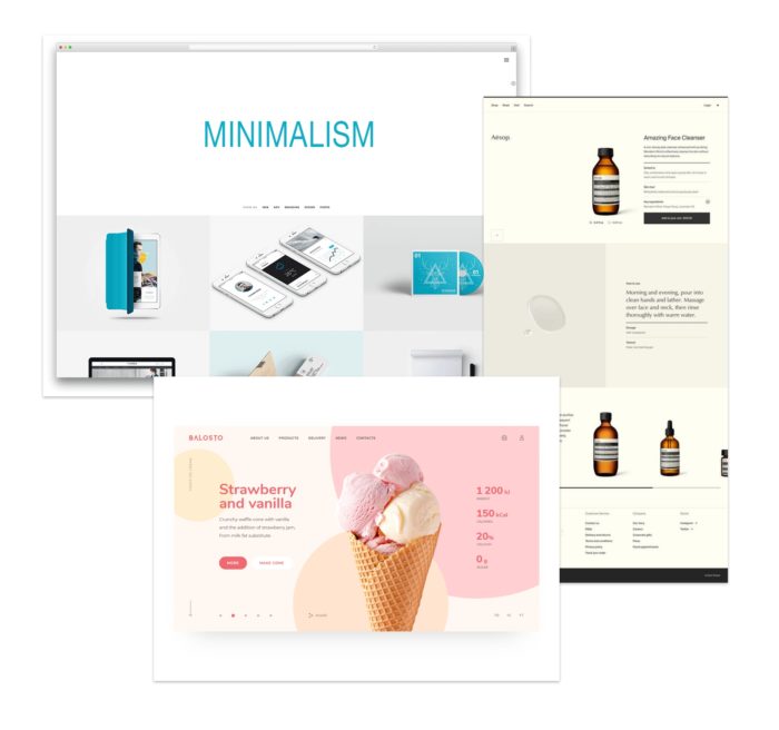
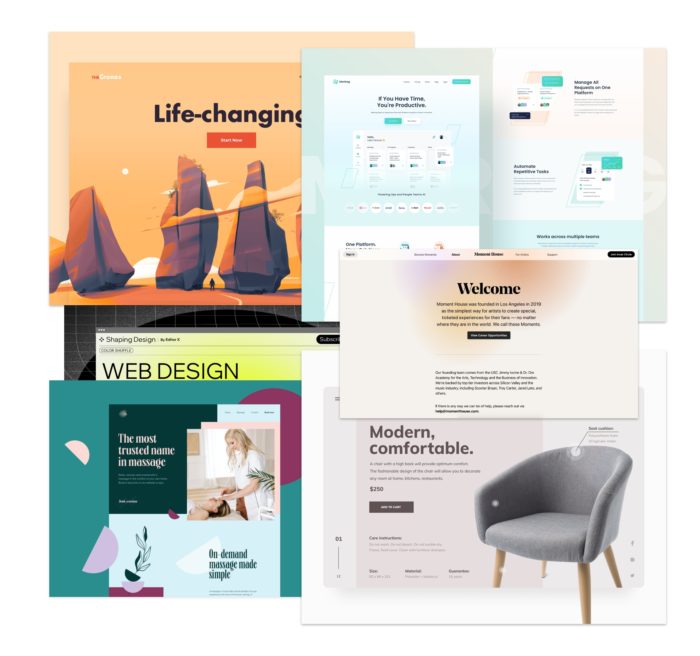
Minimalism has become a design trend that refuses to quit and a go-to for web designers over the last decade. Minimalist design is based around using only essential elements, such as shapes, clean text, limited colors and empty space, to create a webpage that is simple, functional, and impactful.

Colorful minimalism is also on the rise, featuring block colors and bold backgrounds, simple sans serif fonts and minimalist design elements to create a simple yet attractive website design. This approach to web design will continue to be a key component to providing an intuitive and memorable user experience.

3D visuals & photography

Examples of mixed media

3D design has come a long way from the blocky and beveled edges and is being seen less as distracting flair and more as a contributor to the overall user experience and page design. 3D designs can be layered with other elements, such as soft shadows and gradients, adding a sense of uniqueness and depth to any webpage and can be used to captivate your visitors and guide them to their next click.

Photography will continue to be a trend as it helps tell a story, which is why real imagery is preferred to stock photos. We may also see more sites move away from larger hero images and into banner sizes that are more generous to the content on the page.

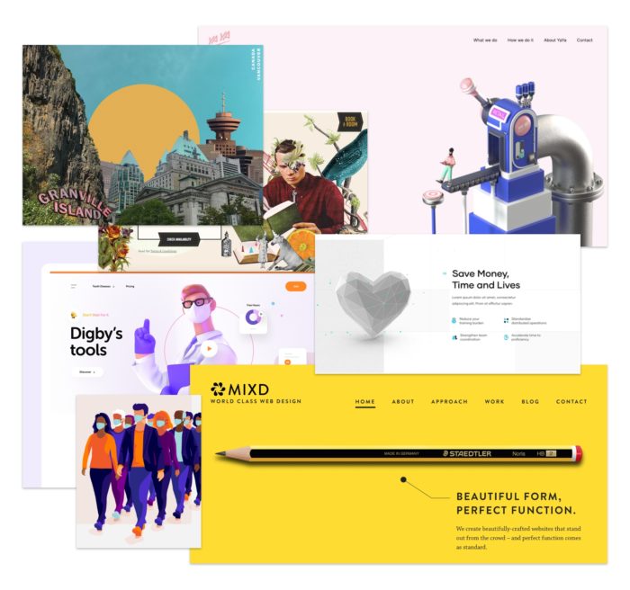
Mixed media is also on the rise. The collage trend of using a variety of media, such as photos, illustrations, graphics, motion and text to create an inspiring and eye-catching aesthetic will remain popular.

Hand-drawn elements & digital art

Examples of Illustrations

These imperfect elements inject emotion and humanity into websites, allowing organizations to connect with their users on a more personal level.

With an increased focus on diversity and representation in design in 2020, many illustrators are now featuring quirky people of all shapes and sizes, a style commonly referred to as “odd bodies”. This is a good way to get more diverse representation on your site when your photography may not match your populations.

Show off your brand personality by using unique hand-drawn icons and elements to get the attention of users. Using a more individual style for your icons can help them stand out in your site hierarchy. Using a more individual style for your icons can help them stand out in your site hierarchy.
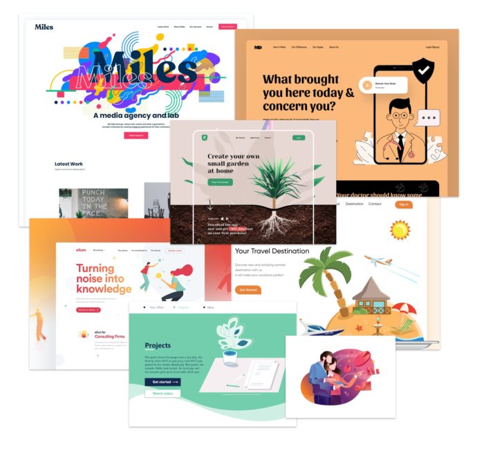
Color & gradients

Examples of gradients

Instead of subtle monotone gradients, we are now seeing multiple colors combined with noticeable contrast. If used appropriately, the contrast creates an illusion of depth and provides a sleek, cutting-edge appearance to your website.

We are also seeing gradients used through fine shading to give a rounded feel to flat icons.

Use gradients cautiously as a background to content to ensure text legibility and color contrast are met across all screen sizes, while zooming the page, and using different text sizes.

In addition, web designers are working to be more conscious of user experience, creating sites that help avoid eye strain. One way to do that is to use comfortable or subdued colors. To make sure things stay accessible, you need to make sure you’re providing a high enough contrast in digital environments, whether on laptops or smartphones. Using a more organic color palette with distinct contrast and finding a middle ground in soft color palettes will provide a less jarring experience. This trend overall may also help with shifting web design concerns more towards accessibility and comfort rather than dramatic visuals.

Typography

Examples of Typography

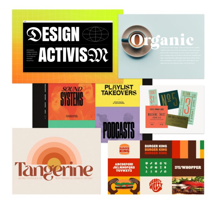
We’ve seen many old things become cool again, and font styles are no exception. Retro and vintage typography are being reimagined and merged with newer, bold styles. Instead of feeling old and stale, the combination of traditional, bold fonts and reimagined, retro fonts gives a bit of a cool and modern spin, while maintaining legibility. We’re looking forward to seeing more creative combinations for typography as 2021 unfolds.

Multimedia experiences

Using multimedia effectively and accessibly can create a richer user experience by bringing together visuals, text, video and/or audio to convey a message. Keep in mind, too much going on can be distracting or overwhelming. It’s important to determine and follow the necessary requirements to maximize inclusivity, such as including pause and play options, among others listed within the WCAG 2.1 Accessibility Guidelines.

Telehealth

One major tool that has risen this past year that’ll stick around in the post-pandemic world — telehealth or virtual care. It’s important to consider a clean, clear design. Make it easily accessible to site visitors and to provide a patient-first experience that best suits your organization. Make it a prominent element in your design and give it a permanent location for users to find consistently.

Personalized design and content

Preference or personalized design can range from changing a site’s appearance and navigation to offering unique, persona-based. Content created for users returning to your website can increase conversion and provide a more intuitive experience. A couple of examples may be to utilize geo-location to present the user with doctors or clinics closest in proximity to where the user lives or to display specific information on care and treatment services that the user often searches instead of the generic content seen by all users.

What’s Next?

While there are many design and UX trends that are appealing to implement, you should strategically evaluate and determine the best approach to meet the goals and needs of your organization, as well as provide the best patient-first experience for your users. Want help? Reach out to Geonetric for guidance from our design experts.

Should My Website and Intranet Look Alike?

How Intranet & Website UX Align

Intranets, like websites, are a digital experience. Users of both have expectations in their use, and many of those expectations align across audiences, from your colleagues and employees to your prospective patients and hospital visitors.

The best designs guide people to what they need

No matter where content lives on the site, well-thought design should help people complete tasks and find what they need, not hinder or distract them. Whether it’s a website or an intranet, a compelling design that’s intuitive to browse and easy to navigate is essential to a good user experience (UX).

People expect great online experiences

Nielsen Norman Group, an expert of user experience research, has found that web and intranet users tend to expect online experiences to mirror their favorite online brands. While this doesn’t mean your intranet or website should look and operate like Amazon or Facebook, it does mean your intranet and website should have intuitive navigation, accurate search results, and pleasing designs that are easy to use across devices.

Responsive design is still essential

Your patients are coming to your site from laptops, tablets, and phones. Your employees may be accessing the intranet or employee communications portal the same way. Limiting your intranet’s design to an antiquated, outdated format hinders your users’ abilities to find what they need when they need it.

People are task-oriented

Social media is for connecting with friends. Amazon and online shopping are for ordering goods and services. When it comes to healthcare, users on both the web and intranet are largely task based. They seek answers to questions, connection points to appointments and forms, or just checking off a box on their daily to-do list, like paying a bill or registering for an event.

Aside from user experience, some organizations have found it beneficial to build their intranet and website on the same platform, such as VitalSite. This is especially helpful for teams that manage the content for both experiences.

How Should My Intranet Be Different?

Your intranet should keep navigation clear and intuitive, and the design should be accessible across devices and meet the needs of your busy, frontline teams.

A well-designed intranet, even if built from a public website template, is better than no intranet or a poorly built one, but there are a few specific reasons why your intranet should have a different design experience than your public-facing website.

Audiences are different

It’s an obvious statement, but your audiences for the intranet are drastically different from that of your public website. Employees are far more task-oriented than prospective or current patients who are browsing your content to answer questions.

Where your public website is a place to spotlight your brand, your intranet should put tasks and resources front-and-center for quick access to help people get their job done. In fact, modern intranets have seen a pivot from document repositories and digital “filing cabinets” to more app-like experiences, with iconography and visual navigation that’s flexible and accessible across devices.

Not sure what your employees, colleagues, and teams need? Start with an employee survey to learn where your intranet is succeeding, and gaps where it could be improved.

User experiences are different

While it’s true your intranet UX should connect your employees to your overall healthcare brand, it should also serve as a connection to their colleagues and teammates throughout the organization.

Investing time and energy in important elements like employee directories can greatly impact not only employee morale and connection, but collaboration throughout your health system.

Likewise, as your health system grows and adds new clinics or hospitals, a location or facility directory can be an extremely helpful tool to help compartmentalize information for audiences in those walls.

Your intranet is a place for your organization to come together under one umbrella to do the best job they can. Design and user experience should be as unique as your organization and the people in it.

Content types are different

A content type, by Microsoft’s definition, is a reusable collection of data, workflow, behavior, and other settings to be used across a system. While your website has content types for provider and location profiles, events, and your service line pages, your intranet’s will be quite different, for example:

  • Employee profiles – Likely require different fields from your provider profile, and more space for information that is pertinent to outside teams and colleagues
  • Events – Employee events might not be classes like your public site has, but instead continuing education opportunities or on-call schedules for front-line teams to access daily
  • Department pages – Not unlike service pages, department pages should explain what the department and team offers, but the information here will likely be different than a service line page for a prospective patient

Content types need consideration with design, which is why working with a designer and developer to create the most effective content types like these will result in a better and more usable intranet experience.

Aside from digital content types, you likely have far more files and documents to connect to your intranet than your public site, and those need consideration, too.

No matter the file types or content types you have, having an intranet content strategy for implementation, functionality, and ongoing governance is crucial to your lasting success.

Conversions (and metrics) are different

Your public site might be trying to invite and capture prospective patients, urging them to schedule an appointment or visit one of your clinics. But your intranet likely doesn’t have the same level of conversions.

Likewise, the return on investment (ROI) of your website might be scheduled appointments, increased patient volume, or donations to your hospital foundation. But your intranet metrics might not be as clear.

One thing’s for certain with intranets: The biggest conversion is employee engagement, which can be measured in a number of ways, such as:

  • Page visits and access
  • Session duration
  • User path, or what pages or documents they click during visits
  • Document downloads
  • Event or class registration
  • Newsletter, blog, or news release visits

Another great thing about redesigning your intranet is the less-analytical ROI, such as improved employee access, fewer calls to IT for intranet help, higher success of new hire training, and better employee self-service and independence for completing tasks or accessing tools.

Can My Intranet Mimic My Website?

If your employees are heavily engaged with your organization’s website, building an intranet design that mirrors your website may be a great way to connect the dots and get people to navigate the intranet more efficiently.

But there are other ways your intranet can mimic your website, too.

Brand recognition

Your brand – not just your colors and fonts – but your mission, purpose, and rally cry for your teams, should be as immersive on your intranet as your website, if not more so. That said, giving your intranet its own brand is a good way to build morale and familiarity with your intranet as one of the essential tools for every employee toolbox.

If you’re approaching an intranet redesign – especially coming from antiquated environments or document repositories like SharePoint – talk to stakeholders about how you can reimagine the intranet experience by giving it its own brand that links your public-facing organization to the missions you live out internally.

Henry Mayo in Valencia, Calif. did exactly that when they redesigned their intranet, HenryNet. Coming off the heels of a recent website redesign, the Geonetric team wove similar elements, such as a horizontal navigation and promotional spaces, into the intranet design experience.

Engage with content hubs

Your public-facing site might have a content hub or blog where you and your experts share information for healthy living, total wellness, or specialty care on a regular basis. You probably share this across your social media profiles, or even through email newsletters.

In the 2020s, healthcare will see an increased presence and need for content hubs on intranets, too. According to Gallup, nearly 74% of across industries employees don’t feel connected to company news, which negatively impacts employee engagement.

Instead of creating printed newsletters for breakrooms, organizations are moving them online into a digital content hub, making it easy for employees to read stories and explore topics relevant to them and their work. And with digital articles, it’s easy to build an email outreach funnel and monitor the engagement through click-throughs and page visits.

Tested, intuitive navigation & design

At Geonetric, we work hard to understand the needs of your core audiences for your public website, particularly prospective and current patients. With that research in hand, we recommend navigation structures, taxonomy, and page design that helps meet the needs of the modern healthcare consumer.

And when it comes to your intranet, you should put in the same level of research and detail.

In the many employee surveys we’ve conducted and analyzed over the years, some comments align time and time again:

  • The intranet is hard to navigate and find what’s needed
  • Search is confusing and doesn’t deliver accurate results
  • Lack of information or outdated information, like employee profiles and departments, make it hard to connect with people when you need them

By implementing an employee survey – both pre- and post-launch of your redesigned intranet – you’ll keep a better eye on what your employees need to do their job confidently and efficiently.

The design you implement is just as important as the navigation, and in fact, supports the employee experience and engagement. A cluttered, mismanaged “junk drawer” of a homepage is going to be far less engaging and easy to digest than one that’s thoughtful and governed.

Get Your Intranet Up to Speed

Whether discussions for intranet redesigns have started in your organization or not, having points like these in hand is a great place to approach any project. If you’re looking for a partner who can guide you through a healthcare-specific intranet redesign, Geonetric is here to help. Contact us today set up a demo of VitalSite, or learn more about our intranet capabilities.

Five Web Design Trends Healthcare Marketers Should Focus on in 2020 and Beyond

Five Web Design Trends Worth Your Attention

Trends focused on supporting intuitive experiences, giving users the information they are seeking with ease, are always in style. Savvy organizations are finding new ways to use design to tell their brand stories and better connect with their audiences, uniquely differentiating themselves from their competition.

What does this mean to healthcare marketers and your websites? Today, patients want convenience, exceptional care, and remote access. A first impression online that provides users with a convenient, intuitive, easy access to their top tasks can potentially kick-start a successful patient journey and ongoing, positive relationship. Design, if accompanied by the right content, will help produce this experience.

Here are the top five design trends for 2020 that healthcare marketers should pay attention to and how your organization could benefit from incorporating some of these into your web strategy.

#1: Inclusive design

Accessibility is an important topic in healthcare web design right now. But stepping back and thinking about accessibility as part of the bigger theme of inclusive design is really where your focus should be. Considering the needs of a diverse population provides a better understanding of your audience.

Building inclusive thinking into the design process early will ultimately provide a better user experience for all visitors on your site, as well as save money and time by not having to retrofit your site to meet accessibility standards. For example, consider color contrast, alternative text for images, text resizing capabilities and many other standards to make your site more accessible. Listen to our on-demand webinar on Website Accessibility and Healthcare to learn more.

#2: Minimalism

Minimalism isn’t a new concept. It’s about expressing only the most essential and necessary elements in a design. This translates into website designs that use space intentionally between elements as to not overload the user, displaying the information users are truly seeking, and making their click path more easily identifiable.

Minimalism is just as much about the functionality as we see more experiences allowing for one-tap registration and instant payment. This comes to mind when thinking about a patient’s click path for actions such as scheduling an appointment, finding a doctor, registering for an event or making an online bill payment. Using minimalism effectively can lead the user through the page by organizing the content and providing balance among the other design elements.

#3: Purposeful micro-interactions

Micro-interactions are small design elements with a single purpose that create engaging, welcoming and human moments for users while interacting with your site. These elements tend to communicate status and provide feedback, helping users see the results of their actions. Popular micro-interactions include simple animations, swipe actions, animated buttons, and call to actions that have a bit of action associated with them, nudging the user to interact.

Micro-interactions can strengthen a brand’s representation based on its active visual and motion design, creating an attached emotion for the user. Visitors can customize their experience based on how they choose to interact with the site. It is important to know your users well in order to serve them effectively with interactions that enhance their overall experience and not take away from it.

#4: Tailored experiences

New devices are inevitable as technology continues to advance and design will continue to adapt as necessary along with it. Web design will have new opportunities to create unique, relevant experiences for users, such as with foldable, touchable displays, voice user interfaces, and personalization based on collected data.

Traditional care is shifting along with technology and with more patients utilizing the convenience of telehealth and other remote healthcare resources, organizations will need to rethink how to best design and create experiences to meet their patients’ needs.

#5: Custom, brand-driven elements

Some of the more visually focused design trends are including dark layouts, diverse typography, and custom illustrations. Dark mode, or using light-colored text, icons, and graphical user interface elements on a darker background, is becoming a popular option, especially as trend-setters Apple and Slack have been embracing it. Dark mode can provide a more enjoyable user experience, drawing the content out and creating a sleek, bezel-less display or illusion on mobile that your website’s design goes from one edge to the other.

Designs are also experimenting more with typography after many years of bold, lowercase sans-serif typefaces. Typography is seeing a bit of rejuvenation with artistic executions and unlikely combinations. Additionally, purposeful, custom illustrations and brand elements are on the rise, translating information to incite emotion to take action and strengthening the brand identity.

Create a great design experience

Deciding whether or not to include design trends into your website is dependent on your organization’s and users’ needs. Regardless of what you decide, use design as a tool to produce the positive experience intended for your site’s visitors and effectively tell your brand story.

And remember, if you’re unsure of how to move forward with your web and design strategy, call in the experts. And, be sure to check out our Digital Marketing Trends to Watch in 2020 webinar for more discussion on healthcare marketing and web design trends.