


Data visualization is not just a way to make your reports pretty; it’s the most effective way to ensure your audience can understand, remember, and take action on your data.
Why Data Visualization Matters
Humans process images 60,000 times faster than they process text, which makes sense as 65 percent of people claim to be visual learners. In a field like healthcare digital marketing, which relies heavily on numbers and data, how can you ensure your data isn’t going in one eye and out the other? Only 10-20 percent of written data is remembered. Data visualization allows us to tap into that visual data transfer which results in roughly 65 percent of visual information being remembered.
When you need to prove success, get buy-in, or take action it’s imperative that your data is easy to digest. Often times your audience does not have the same analytical mindset that you have, and presenting an excel spreadsheet full of numbers and formulas might not effectively represent your intended message. Data visualization helps enable you to tell your story and prevent that message from being lost in translation.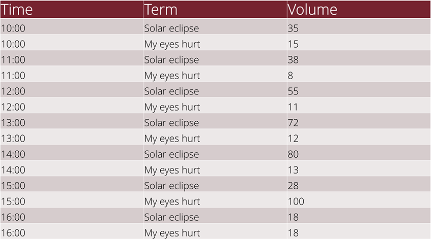
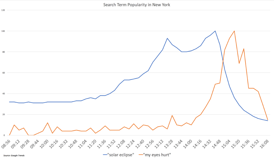
Above we can see two representations of the same data. While we can extrapolate the connection between the two search terms in the table, it’s very difficult to understand why this data is being presented without a thorough explanation. However, a simple chart allows us to immediately understand the correlation between people searching for a solar eclipse and searching for reasons why their eyes hurt. Without the visual approach to this data, it would have been very hard, if not impossible, to understand the data being presented.
SEO & Data Visualization
As a healthcare SEO (search engine optimizer) you work with a lot of different tools to accomplish a lot of different initiatives. You use analytics to understand your website and how your users are interacting with you online. You use tools to track organic rankings, to run specific campaign initiatives, and to run tests on your site. With all of these different sources of information, it’s very easy to get bogged down in the data and lose sight of your goals. Data visualization is the answer.
Creating reports or dashboards for your SEO efforts can allow you to comprehensively connect the dots and understand what’s working and what’s not. Beyond the simple yes or no answers, it allows you to use your data to drive decisions and shift your priorities. Creating visualizations based on UTM parameters, organic keyword forecasting, A/B tests on specific service line pages, or your conversion funnels allows you to take a micro or macro approach and confidently optimize your efforts.
One of the places where many healthcare marketers struggle is analyzing, understanding, and responding to the competitive landscape for a specific service. Creating visual representations of this data allows you to easily identify gaps where you can focus your initiatives. Understanding where each competitor ranks organically for high-quality keywords, knowing where they spend their marketing dollars, and identifying what content they’re having success with is critical. Instead of lines and lines of text and numbers, creating visually appealing and effective charts and tables can save time and resources on finding and implementing solutions. Having a more complete picture of the competitive landscape can be quickly dissected and iterated upon.
Choosing the Right Data
When determining which data you should include, you should ask yourself some simple questions:
- Why are you doing this?
- What story are you trying to tell?
- Who is your audience?
The ‘why’ behind your data is one of the most important aspects of selecting data. Selecting data is not synonymous with cherry-picking data. Maybe you’re simply trying to understand your users. Perhaps you’re trying to get some buy-in from stakeholders, or simply analyzing the results of a specific initiative. The why behind your data should be aligned with your organization goals, and should already have a defined measurement plan for success. Understanding the why should lend itself to an understanding of which data points are important.
Once you’ve determined the ‘why’, you should also quickly make the connection to the ‘what’. What story are you trying to tell? Like all data, there should be a point of sharing it. You might be comparing results of your marketing initiatives, determining desire paths on your site in relation to the user paths you’ve provided, or attempting to understand how different experiences interact and align. Similar to the ‘why’, the ‘what’ behind your data needs to be established before you can effectively communicate said data to your audience. A good practice is to ask yourself “So what?” when you’re analyzing your data. Being critical of the data you’re preparing allows you to ensure that your audience can take action on what you give them.
The ‘why’ and the ‘what’ should provide you with the most valuable data you need to utilize to create your visuals. However, the final piece in determining what goes where is understanding who will be viewing this data. Members of your team likely do not have the same needs as an internal stakeholder. Your agency partner(s) likely have a more solid grasp on the state of your website and can likely react to much more detail-oriented data, while a physician for a certain service line might require the highlights.
Asking yourself these three questions will enable you to craft visual data representations that speak to your audience in a way that will produce results. Beyond being actionable, this data will resonate more with your audience and be more memorable, making future conversations even easier. Using a tool like Google Data Studio (GDS) will also allow you to dynamically refresh, reuse, and repurpose these visualizations which will save even more time in the long run.
Choosing the Right Visualization
Once you’ve determined what data you need to present, you need to determine the best visualization to showcase that data. There are two general types of visualizations: tables and charts. When looking at your data here are some quick ways to identify the most effective visualization:
Use tables when:
- You have large amounts of data
- You need the ability to drill down in your data
- The figures must be precise
- Specific datasets require attention
Use charts when:
- You have fewer datasets
- Your data needs to be simplified
- Your data is quantitative
- You’re trying to showcase trends
When you think of tables you probably think of a simple excel spreadsheet, maybe with some filters layered over the columns. However, circling back to GDS, you can add additional elements to your tables to still make them visually appealing and easy to digest and take action upon.
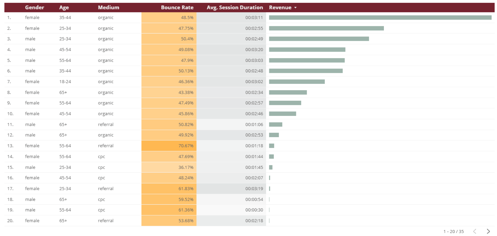
As you can see in this table we have some demographic information, broken down by medium, analyzing how those specific segments of users interact with our site and how they contribute to our revenue. Although this is a table with a large number of data points included, it’s still easy to understand; females age 35-44 drive a large portion of our revenue. We can also extrapolate that the more time people spend on our site the more likely they are to convert into “buyers”. Tables can be a very effective data visualization medium if your ‘why’ and ‘what’ are strategic and intentional. Alternatively, charts are an instrumental tool in showcasing smaller datasets and establishing, reporting, and taking action upon trends. Layering different chart types on top of each other allow us to compare and contrast our story without having to highlight specific data points.
In the example below, we look at how organic searches translate to sessions and how that impacts our revenue. This data is broken down by days of the week, which is very useful when determining to schedule for our marketing initiatives.
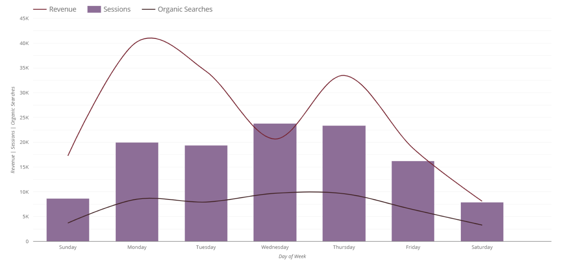 While this chart is telling a very clear, compelling story, we don’t need to emphasize the exact figures. We simply want to understand trends that we can then turn into data-driven decisions moving forward. When we do need to dive deeper into the data from a more qualitative perspective, we have the ability to transition this data seamlessly into a table. This is why understanding your audience is so critical; getting buy-in from your stakeholder(s) might require showing this type of trend that supports your tactics and strategies, while the next steps might require your team to look at the data a little closer. Effective data visualization allows for fluidity.
Key Takeaways
We use data every day to make informed decisions on where to spend marketing dollars, how to staff our teams, and getting stakeholders to understand the value and reasoning for our efforts. You have likely heard someone say, “What does this mean?” or, “What am I supposed to do with this information?” and you’re left scratching your head because, to you, those answers are clear and obvious. Our audience doesn’t always speak our language, so our data needs to be translated into a more universal tongue: visualization.
Data visualization provides insights that are more digestible, customized to meet specific informational needs of your audience, and reduce the likelihood of individuals misunderstanding or misinterpreting the data you’re sharing. By presenting your data in a visual manner it streamlines your communication and your optimization or strategic initiatives. Beyond increasing effectiveness, data visualization makes receiving buy-in much easier. However, data visualization can be overdone. It’s important that your story doesn’t get lost in the presentation, so ensure your visuals don’t distract from the data you’re trying to showcase. Establish your goals, determine the ‘why’ and the ‘what’ before you start, this will keep your visuals effective and reduce the likelihood of unnecessary complexity. Select the data that matters, sometimes we add fluffy vanity metrics to help ease the conversation, if you effectively present your data in a visually appealing way, that becomes unneeded.
Remember that people process images exponentially faster than text, which is why you’ll likely revisit the written portions of this blog. Your data doesn’t have to be a point of contention, it can be the solution. If you need help translating your data into visually appealing stories or setting up a dashboard for your campaigns in Google Data Studio, contact us. We can help you set up a template with an experienced digital marketing expert for free. You can also check out this popular webinar to find more information on data visualization for healthcare.