Healthcare Websites and Keyboard Interface Accessibility

It’s important to understand that making your hospital’s website work with a physical keyboard is less about using the keyboard specifically and more about allowing your website to work for all input devices, such as a keyboard, mouse, switch devices, etc.

By programming your website to work with a keyboard, you are essentially programming it to work for all input devices as those input devices usually emulate or work similarly to a keyboard. You also do your part to meet the keyboard accessibility standard for WCAG 2.1 guidelines, as well as creating a more user-friendly site, in general.

Reasons to keep keyboard navigators top of mind

Here are three use-cases for hospital website visitors that hit home the need to consider how your website interacts with physical keyboards.

  1. One of the benefits of responsive design is that users can zoom to get the mobile view on a large screen. This is particularly helpful for people with low vision or those with certain concentration or cognitive disabilities. Zooming to the mobile view on a large screen allows users a more clear, focused, and simple layout.Because there are a large number of people with multiple disabilities who may not be able to use a mouse or touch screen, you need to make sure this mobile view also works well with a keyboard.
  2. Some people have tablets mounted to their chairs and operate them not with touch or a mouse, but rather with a switch device or other input device. Again, by ensuring your mobile and desktop sites both work with a keyboard, you are also ensuring they work with most types of input devices.
  3. Screen readers on touch screen devices disable the normal touch functionality. This means that swiping left and right would not advance a carousel banner, but instead reads either the next or previous element on the page, or the next or previous letter in a word, depending on the user’s settings. In this situation, you wouldn’t be using a keyboard to interact with the mobile site, you’d be using a wide variety of swipe and tap combinations. By programming your mobile site to work with a keyboard, you also ensure it will work properly with a mobile screen reader.

Inclusive design means excellent user experience

At the end of the day, designing with accessibility in mind makes the user experience better for all users, regardless of ability. If you have questions about inclusive design or are looking for answers to your accessibility questions, contact us. In addition, our team of experts would be happy to provide feedback on your healthcare website. Simply sign up for a free accessibility check-up and we’ll be in touch!

Make the Most of Your Investment in Video with Captions

Investing in video makes sense — but it’s important to do it right.

Have you ever been in a public, quiet space without your headphones and needed to watch a video? Or, perhaps one of the characters in the show you’re binge watching has a strong accent, and you can’t understand what they’re saying. If you’ve ever been in one of these situations, you know how handy captions can be. Captions are not just a “nice to have” feature, they are necessary for some people.

Adding captions to your videos and allowing users to toggle them on and off provides a better user experience for everyone and helps your site be WCAG 2.1 AA compliant.

Here is guidance for adding captions, audio description (AD), and transcripts to your videos.

Captioning for Accessibility Compliance

Captions can be confusing if you do not realize there are several different types of captions.

  • Basic Captions: These are written words, visible on the screen and synced with the video, often used by people who have difficulty hearing.
  • Audio Description (AD): During pauses in the main sound track, AD provide information about what is happening in the scene (scene changes, characters, actions, and on screen text) for those who cannot see.

It’s important to note that prerecorded videos (with sound and visuals) need to be captioned for both of these user groups in order to be AA compliant with WCAG 2.1. Videos that are live streamed, have yet another set of guidelines you’d need to follow.

How to add captions

There are several ways to add captions to your videos and your approach depends mostly on where the videos will be hosted. Captions can be created using a time stamped text file (.srt, .sami, .xml) that is loaded into a media player and can be turned on or off. These are called closed captions. Or captions can be “burned into” the video layer during production and are always visible, these are called open captions.

Different media players support different types of caption files. There are basic and advanced closed caption files.

  • Basic file formats (.srt, .sbv, .sub) only require basic timing information
  • Advanced file formats, such as WebVTT, are recommended because users can configure the font, size, and color to make it easier for them read. Once those settings are saved, they are applied to any WebVTT video that user comes accross

Try not to rely only on one caption file format. Including both a basic and an advanced will ensure your captions are published and viewed by the largest audience.

Many popular video platforms allow you to upload your own captions. For example, YouTube allows you to use “Automatic Captions” or upload your own .srt file.

If you do not have a .srt file, using the automatic captions is a nice place to start, but be aware that YouTube doesn’t always translate the best, so you’ll likely need to go into the generated .srt file and correct some of the text.

How to add audio description

AD is typically added by creating an additional audio track that provides verbal descriptions of the visuals in a video. AD is rarely available, but is required to be AA compliant with WCAG 2.1.

Sometimes, in order to provide the amount of detail necessary, the video needs to be paused while the scene is being described and then started again. If this is the case, it’s usually easier to create two different videos, one with AD and one without. In order to comply with WCAG a version of the video with AD simply needs to be made available. This means that you can embed the version without AD your site, and provide a link to the version with AD.

Not all videos need AD, for example, if the video is simply of a doctor talking to the camera and there are no other visuals (charts, graphs, video clips of them walking through halls or smiling at patients, etc.) then, as long as that doctor introduces themselves at the beginning of the video, AD is not necessary.

YouDescribe is a free online tool that allows you to take a YouTube video and create an audio description soundtrack. There are also companies that will describe the video for you, such as AI Media and CaptionSync.

How to add transcripts

Although only mandatory to be AAA complaint, adding a transcript for your prerecorded media is a good idea.
A transcript is the only way that someone who is both deaf and blind can access the content in your video. The transcript needs to display as text on your website so it can be output in brail on a refreshable brail display.

Transcripts are important for not only video files, but audio files (like podcasts) too. Transcripts typically read like a screen play, including both the spoken words and descriptions of each scene.

There is another perk to adding transcripts for your audio and video files. Just like assistive technologies, web crawlers read text. Providing text versions of your media allows web crawlers to index the wonderful content you’ve spent so much time creating.

Time to get started!

If you’re looking for more information, check out the W3C guidelines on captions. YouDescribe offers a nice step-by-step tutorial on adding AD, and the Bureau of Internet Accessibility shares some tips for YouTube closed captioning. If you’d like to talk to a member of our team about how to improve the accessibility on your site, you can sign up for a free accessibility checkup.

The Case for Mobile Menu User Experience

The world isn’t accessing the web on desktops and laptops alone anymore. No, they’ve moved on to using voice assistants, tablets, and smartphones. People are browsing the web from city buses, hotel lobbies, or their living room couch.

Regardless of where these people are, they still need to be able to explore your website with ease, and mobile navigation is how they do it.

How we use our smartphones

Mobile menu UX has been under a microscope for several years, especially as our mobile overtook desktop in 2016 as the primary way people access the web.

UX researcher Steven Hoober observed more than 1,300 people tapping away at their phones as part of a study, and found that in almost every case, we hold our phone three different ways:

  1. One-handed (in one dominant hand) with the thumb navigating the screen;
  2. Two-handed, with the less dominant hand cradling the phone and the dominant index finger navigating the screen;
  3. Two-handed, with both thumbs navigating the screen (or, in many cases, typing from the keyboard)

examples of different hand positions holding phones

Interestingly, Hoober also found that people often switch between these three positions depending on their task or setting.

Our thumbs have become so integral to the use of our phones that medical researchers have proven a correlation between the use of our phones and developments in “thumb pathologies,” including pain or stiffness in some cases; in others, lower thumb strength because we’re not holding pencils and pens which require a firmer grip.

Understanding these observations and adaptations means we should create a smartphone experience that is ergonomic and comfortable for all users, regardless of how they hold their phone.

Trends in mobile menu UX

You’re probably most familiar with the “hamburger” navigation icon at the top of most webpages. It looks like this:
picture of adventist mobile healthcare site with hamburger icon highlighted

Hamburger icon
This icon typically holds the main, secondary, and any tertiary navigation. When clicked, it may drop down from the top of the screen or slide out from the side. No matter how it functions, it’s your blueprint to travel the site.

The usefulness of the standard mobile “hamburger” menu is hotly debated in UX communities around the world. Nielsen Norman Group – a leader in modern digital usability research – compares it to fast-food chains : “It got designers addicted to its convenience, and now serves millions each day.”

In terms of advantages, hamburger menus are great for a large number of navigation items and a nice way to keep your design clean and free of clutter. However, because they’re “tucked away” in the corner, this menu can be easy to miss and can quickly turn into a junk drawer of links without proper governance.

Icon-only navigation
Icons have their purpose, but they can quickly move into bad UX territory when overused or not explicitly clear.

Icons work best when paired with copy. And, depending on your audience – including culture, language, and cognitive understanding – the icon image you use could represent many things, for better or worse. Nielsen Norman Group finds that universal icons are rare, but do exist, such as:

  • Magnifying glass for search
  • Shopping carts for online carts
  • Envelope for email or mail

But less familiar across cultures are things like people icons (for online portals), or stars (for bookmarks or favorites).

Icons with copy can be helpful for task navigation, especially on mobile devices when they’re a “tappable” size for a finger or thumb. It’s best to test your icon approach with real users to see if they’re understood and helpful.

icon examples
Icons without accompanying text aren’t as powerful or clear for most users.

Visible navigation
Visible navigation has been gaining strength in recent years, especially as the hamburger menu alone doesn’t perform as well without a label.

So designers have taken it a step further, recommending more visible navigation, almost in the form of tabs. In fact, tab navigation has been noted as the new hamburger navigation as early as 2018.
screenshot of cape cod healthcare mobile screen

Anchoring visible navigation
This visible navigation can be used at the top of the screen, or the bottom of the screen. And anchoring these visible navigations have become a growing trend, too.

By anchoring navigation items, especially to the bottom of the screen where our thumbs are, you’re meeting users in an ergonomic sweet spot that makes these actions easy to reach.

Mobile menus in healthcare

Mobile menus on healthcare websites have primarily been relying on the standard hamburger menu that the UX world has seen for many years. And it makes sense. Healthcare websites are trying to reach a variety of people across different ages, genders, cultures, and web literacies. Creating a “hip” or “different” experience could alienate people if it’s not a proven and accepted norm of web UX.

But as relationships with mobile devices change and generations continue to adapt to new ways of finding information online, the way you implement accessibility of mobile menus and navigation should drive positive change for all patients.

Testing will uncover a path to success

If you haven’t analyzed your mobile menu in a while, a new assessment would be a good place to start. Some of the ways you can use an assessment to understand how your menu is performing including:

  • Heatmap analyses can help you understand how users are (or are not) using your mobile site today, including scroll depth and mobile menu taps.
  • Live user testing will also allow you to gain meaningful feedback from real people as they use your website.
  • A/B testing is another way to see what resonates with your audience. By launching two versions of a mobile menu, you can track their effectiveness through methods mentioned previously, like heatmaps and live user testing.

Once you implement a new mobile menu approach, keep a close eye on the analytics. Is traffic dropping off more than it did before? Are customers staying longer and exploring more pages? Is the search function increasing in use because things are harder to find, or is it decreasing because the navigation is easier to reach?

Understanding how your audience actually uses your website allows you to deliver a positive user experience.

If you’re looking for a partner to help you improve the user experience of your mobile menu, look no farther than Geonetric. Contact us today to get started with a mobile UX assessment.

How to Write Alternative Text and Improve the Accessibility of Your Hospital’s Website

The good news is that Geonetric is here to help. Let’s start with the basics.

What is alternative text and why do I need it?

People who have low vision or who are blind typically use assistive technology called screen readers. A screen reader does exactly what it sounds like: It reads what is on the screen. Proper HTML markup is important so that screen readers announce things properly.

When a screen reader encounters an image, it says a phrase like “graphic,” followed by whatever text is added as the alternative text, also known as alt text. If this alt text does not exist, some screen readers will try to guess what the image is by reading the file name.

By applying alternative text to your images, you’ll help people with low vision or blindness understand the context (and content) of the page. Often in healthcare marketing, we add images to pages to elicit an emotional response, or tie the content together in a visual way. For people who can’t see the content or pictures, an alternative text description can help fill that gap.
Alternative text is necessary for screen readers, but it also:

  • Displays if a person disables images from loading
  • Displays if a path to an image is broken
  • Helps web crawlers understand what your image is about so it can be properly indexed

How do I add alternative text?

There are multiple ways to add alternative text to images, but the most common method is to use the alt attribute. In HTML, you’ll find the alt attribute looks like this:

<img src="image.gif" alt="This is alternative text" />

When using a content management system (CMS) like Vitalsite, WordPress, or Drupal there is typically a field to enter alt text when adding an image to a page. Then, the CMS generates the HTML markup.

How do I write good alt text?

Writing good alt text is a bit of an art form. Your goal is to write a description that gives a blind user an equivalent experience to a sighted user—not more, not less. It’s also important to take into consideration the context of why the image is on the page in the first place.

For example, a page about a birth center may have an image of a sleeping baby. In this instance, “sleeping infant” may be all that’s necessary to describe the image.

Now let’s take that same image and put it on a page titled “Safe Sleeping for Infants.” This time, instead of “sleeping infant,” you may need to say “Infant, laying on her back in a crib,” so the image has more appropriate detail on context with the topic.

Example of infant in a crib as previously described

Alternative text best practices

When it’s time to add images to your page or website, or you’re ready to go back and fill in all your missing alt attributes, keep these best practices handy:

1. Don’t include “This is an image of…” in your alternative text. Screen readers will announce “image” or “graphic” before reading the alternative text. Adding “Photo of…” is redundant and clunky to the user’s experience.

However; an exception to this rule applies if you’re describing a work of art and its context is vital to the experience. You’ll see alternative text for art such as, “Sculpture of David by Michelangelo” or “Lithograph by M. C. Escher titled Drawing Hands.”

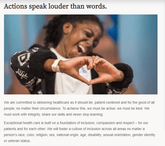
2. Describe only what you see. Avoid attempting to interpret feelings or emotions, or provide more information than a visual user would receive.

Example image, described in the following paragraph

Take for instance the above image. This image’s alt text could say, “Nurse talking to an elderly couple at Benefit Health Cancer Center.” However, this is providing more information than a visual user would get. Why? Because the image doesn’t explicitly state where this scene is taking place. This couple could be at home, or in an assisted living facility. We also don’t know if this is a “cancer” discussion or just an at-home visit. Remember: If it’s not obvious to a sighted user, don’t include it in the alt text. We’re aiming to deliver an equal experience to all by allowing the user to interpret images based on their journey and emotions.

3. Don’t keyword stuff your alternative text. Alternative text, like the other text on your site, should be realistic and human, and simply describe the image. Keyword stuffing is a black hat practice and won’t get you any points with the search. In the end, it just delivers a poor experience to people using a screen reader.

4. Avoid abbreviations or technical terms. Again, like other content on your site, you should be considering the health literacy and experience of the real people using your site, particularly patients and healthcare consumers. Medical jargon and abbreviations might mean something to your doctors, but they’re not so clear to a patient or someone with lower health literacy. Aim for clear, people-friendly terminology that’s easy to understand.

5. Keep the alternative text concise, approximately 250 characters or less. Use a character counter in your word processor or through tools online to check the length and stay within best practices. You won’t be penalized if you go over this amount, but it will likely annoy people using a screen reader.

6. Complex images may need more consideration. Detailed and complex images, like charts and graphs, may require more than the “best practice” 250 characters to adequately describe the image. In these cases, it’s best to give a brief description in the alt text, followed by a long description. There are several different ways to accomplish this, but the easiest is by adding a few paragraphs of text describing the chart directly on the page.

Your alt text may be something like “Bar chart of procedures for the year. A detailed description follows.” Then, after the chart, you would add as much text as necessary to accurately describe it, listing each month and the number associated with it.

Example:
<img src="/images/chart.png" alt="Bar chart of procedures performed in 2019 by service line. Detailed description to follow." />

Example chart. Detailed description to follow

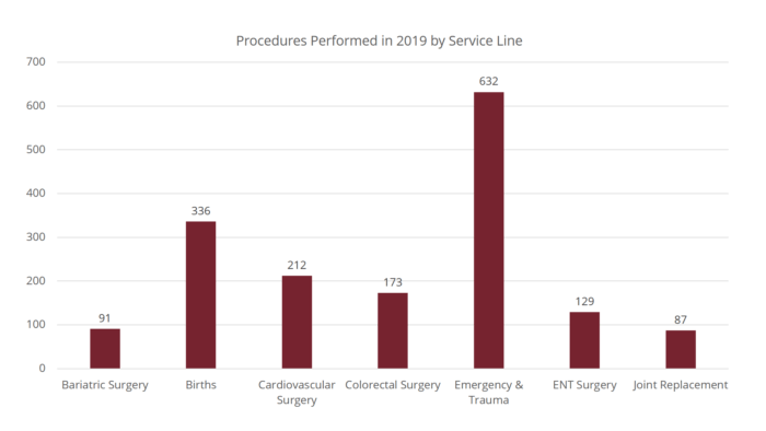
In 2018, Benefit Health performed 1,660 procedures and surgeries. This data represents a breakdown of seven critical departments responsible for these procedures. This data is captured through daily statistics throughout the healthcare system. The surgeries performed are as follows:

  • Bariatric surgery, also known as weight loss surgery: 91
  • Births in the birth center: 336
  • Cardiovascular (heart) surgery: 212
  • Colorectal surgery: 173
  • Emergency and trauma procedures: 632
  • Ear, nose, and throat surgeries: 129
  • Joint replacement (knee, shoulder, etc.): 87

Not only does this help people who are blind, but it also helps those patients or healthcare consumers who may have a hard time understanding charts.

7. Avoid using images of text. However, in rare instances (such as logos or word art), the alternative text should match the text in the image.

8. For images that are buttons, the alt text should describe the action. For example: If you have a form that uses an image of an arrow as the button to submit the form, the alternative text for the image should say “Submit,” rather than “arrow pointing right.”

9. For images that are links, the alt text should describe the destination. Do not include alt text that says “link to…” because screen readers will announce “link graphic” before the alternative text.

One common example is using Facebook’s “f” logo as a link to your organization’s Facebook page. In this instance, the alternative text should not be “Facebook logo” but instead “[Organization name] Facebook page”.

Does every image need alternative text?

No, not every image needs alternative text. If the image is purely decorative or redundant to the content on the page, then the alternative text is unnecessary. In these cases, keep the alt attribute empty.

How do I know if an image is decorative?

If you’re using our VitalSite CMS, most instances of decorative or redundant images are handled at the template level. This means your developers at Geonetric already did the hard part for you.

The majority of images you’ll add to your pages will need alternative text. If you’re ever questioning whether or not an image needs alternative text, the W3C has a handy decision tree that can help.

In the end, we’re here to deliver a good user experience.

Yes, alternative text can help you rank images in search. But more than anything, it’s important to deliver a website experience that’s equal for all. Failing to add alternative text only puts walls around content for real people and makes them question what they’re missing.

While alternative text falls parallel with other topics on “accessibility,” these guidelines and tips for best practices really are more about inclusive design—design for all. If you’d like help writing alternative text for your site or talking about other accessibility best practices, contact us.

Six Common Accessibility Errors on Websites

Six of the Most Common Accessibility Issues Websites Face Online

WebAIM did an accessibility analysis of the top 1,000,000 home pages
on the most popular websites across industries, and what they uncovered is interesting. All of these sites, regardless of industry, tend to have the same six common accessibility issues plaguing their sites:

  1. Low Contrast: For people who have low vision or colorblindness, low contrast is a real issue. If the text and icons are not easily distinguishable from the background, some users will not be able to see the information on your website. This isn’t just a nice to have feature for people with low vision, it simply requires less strain and cognitive effort from all users.
  2. Missing Alternative Text: People who are blind or have very low vision typically use assistive technology called screen readers. Screen readers do exactly what it sounds like—they read what is on the screen. The proper HTML markup is important so that screen readers announce things properly. When a screen reader encounters an image, it will say a phrase like “graphic” followed by whatever text is added as an alternative text. If this alternative text does not exist, some screen readers will try to guess what the image is by reading the file name. Alternative text typically should describe the image and be 250 characters or less. Check out these tips for writing alt text.
  3. Empty Links: Quite often, we will find links on a page that do not have any text inside of them. In the HTML markup they look something like this:

    <a href="https://www.geonetric.com"></a>

    As opposed to the correct markup for a link which would look like this:<a href="https://www.geonetric.com">Geonetric</a>

    Empty links are usually the result of a deleted link when using a WYSIWYG (what you see is what you get) editor. The editor will delete the text from the page but doesn’t always remove
    the link from the markup.

  4. Missing Labels: Every form field on a website needs to have a label. It’s highly recommended that these labels are visible for all users, but at the very least these labels need to be in the HTML markup and programmatically tied to the correct field. Placeholder text is not a valid label.
  5. Missing Language: Every page on a website should have a language attribute that tells screen readers how to pronounce words and which dialect to use. It also helps translation tools know what language the page is originally written in. The language should be set on the opening html tag, typically done inside the template files.However, if you change languages anywhere on your site, you need to declare what language you are using. For instance, if the default language on your site is English, but you have a paragraph of text written in Spanish, you need to add lang=”es” to that paragraph tag to tell screen readers which language to use.

    <p lang="es">Esta frase es en espanol.</p>

  6. Empty Buttons: Like empty links, empty buttons typically happen by accident. WYSIWYG editors will delete the text inside the button, but leave the markup on the page causing empty buttons. These are easy to remove if you know what you are looking for. They will typically look something like this:

    <button class="SomeName"></button>

    As opposed to the correct markup for a button which would look like this:
    <button class="SomeName">My Button</button>

Create a Plan of Attack

Healthcare websites are not immune to these same issues. And, it’s important to note that web crawlers can only identify certain types of barriers. There are likely additional issues on your site.

Learn more about how to check your healthcare website for accessibility issues and be sure to watch our webinar on Accessibility and Healthcare. Then contact us to get started.

How to Check Accessibility on Your Healthcare Website

Types of accessibility tools

There are two different kinds of tools that can check your hospital website for accessibility errors.

1.) Browser plugins or extensions: These allow you to evaluate one page of your website at a time, and are effective if you are making edits to one specific page.

2.) Automated site crawlers: These are tools that crawl your entire site, listing every single error it finds in one report.

Both of these types of tools are valuable depending on your needs. They give you quick results, don’t require technical expertise in order to use them, and can provide a roadmap of some top areas in which you may need to invest.

But it’s important to understand that even the best tools only find about 37% of your accessibility problems.

That’s because these tools check your code to make sure certain elements and tags exist, but they cannot determine if those elements are meaningful, relevant, or understandable to an end user.

Why accessibility tools alone fall short

Here’s an example from a healthcare website’s mission page.

Screenshot of a healthcare website's mission page

In the screenshot above are the words, “Actions speak louder than words” followed by an image of a young girl extending her arms and using her hands to make a heart shape. Below the image are more paragraphs of text talking about the organization’s commitment to delivering patient-centered healthcare.

Upon inspecting the HTML code, we can see that this image has an empty alt tag.

<img src="/util/images/mission-and-values.jpg" alt="">

If you were to run this page through an accessibility checker tool, it would flag this image for not having alt text. Now let’s pretend you were editing this page to make it more accessible, and you added alt text to say “Girl” then ran the testing tool again.

This time the tool would NOT flag the image because it does include alt text. However, the alt text “Girl” isn’t very descriptive and doesn’t convey the author’s intent of this image, therefore it does not meet WCAG guidelines.

The image was put on this page for a reason. The author was trying to evoke some kind of feeling or send some kind of visual message. If we do not adequately describe what is in this image, a person with little or no vision will miss out.

Web accessibility requires tools plus human judgment

Web accessibility tools are an effective way to start evaluating your site. They automate a lot of manual testing and help you see where you have opportunities to improve. They also give you an idea of the amount of time and resources you’re going to need to allocate.

As the alt text example highlighted, human intervention is still required to review the output of the reporting tools and determine if what’s there is meaningful to the user. An accessibility expert can also review the report and help put a plan in place to tackle any issues based on what changes will produce the most value while taking into consideration what user paths are most popular on your site.

Remember, at the end of the day accessibility is about real humans creating optimal experiences for real humans.

If you’d like to learn more about web accessibility in healthcare, including how to best use tools and humans (internal or external team members) to recreate an accessibility action plan, check out this webinar: Website Accessibility in Healthcare.

Website Accessibility & Healthcare

And it matters even more for the healthcare industry, as access to care is your top priority. As your organization works to enhance the user experience, it’s important to put a plan in place to ensure people with disabilities — such as those with color blindness or hearing loss – can still interact with your hospital’s site. Ensuring your website works with assistive technologies isn’t just the right thing to do — recent lawsuits are making more healthcare organizations take notice of accessibility guidelines and best practices.

Join Amanda Gansemer, Senior Web Designer and Developer, Geonetric, and Kevin Rydberg, Senior Digital Accessibility Consultant, Siteimprove, as they dig into why hospitals should be investing in accessibility and how to get started. You’ll learn:

  • The opportunities and risks associated with accessibility and the web
  • What it means to be accessible
  • An overview of important standards and why they matter
  • The tools available to help you understand how accessible your site is — or isn’t
  • How to create an accessibility plan to achieve short-term goals as well how to develop strategies for long-term success within your organization