New Digital Presence Strengthens Brand for Innovative Health and Wellness System

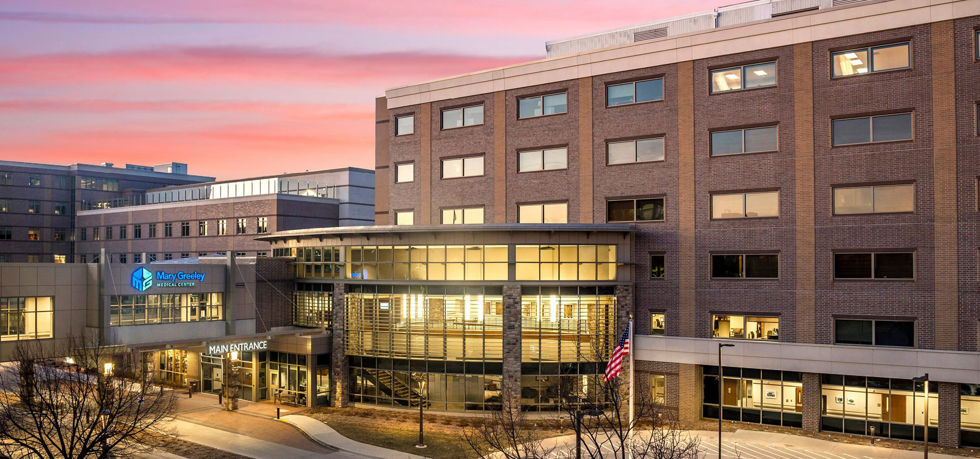
Montage Health is a family of organizations dedicated to keeping Monterey County, California healthy. With a 258-bed hospital, Community Hospital of the Monterey Peninsula (Community Hospital), a medical group, philanthropic foundation, urgent care clinics, employee wellness program, wellness center, and Medicare plans, Montage Health has more than 2,500 employees and serves more than 434,000 residents.

Although the name Montage Health was chosen in 2016 to represent the system’s “montage” of services, the system has a long history, serving the area for almost 9 decades. The organization’s flagship hospital, Community Hospital, got its start in the 1920s. The Community Hospital name became synonymous with the entire system, even as the organization grew to encompass much more than the hospital.

With multiple websites and a fractured user experience, Montage Health turned to long-time partner Geonetric to create a new web presence on the VitalSite content management system that builds brand awareness for the entire Montage Health system.

Taking a user-focused approach to site organization

The first phase of the project centered on creating a strategy for combining all seven entity websites into one site. From assessing gaps in the user experience to applying user behavior data to diving into the system’s organizational structure, Geonetric’s content strategists built an information architecture that put site visitors first while still representing all entities.

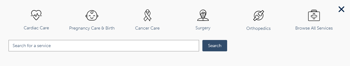
The Geonetric team performed qualitative usability testing, asking site users to complete common tasks — like finding a doctor or location — using different wireframes. Testing revealed site visitors used access-to-care features as a way to help navigate to different types of providers. This insight led to the creation of a Care & Treatment landing page that gives site visitors guidance to choose the best option for their unique needs and preferences. An interactive flip card design and clear, concise copy help users immediately navigate to the best care setting for their needs.

Letting design shine

Building from Montage Health’s brand style guide, the site design leverages the vibrant colors and coastal community the system calls home. Custom icons were created as well as a unique accent bar that helps draw the eye to important calls-to-action.

With the rebrand, the system was working to calm community fears that they had been bought by an outside organization. Montage Health used the redesign as an opportunity to reinforce their community ties by using photos of real locations, real patients, and real employees.

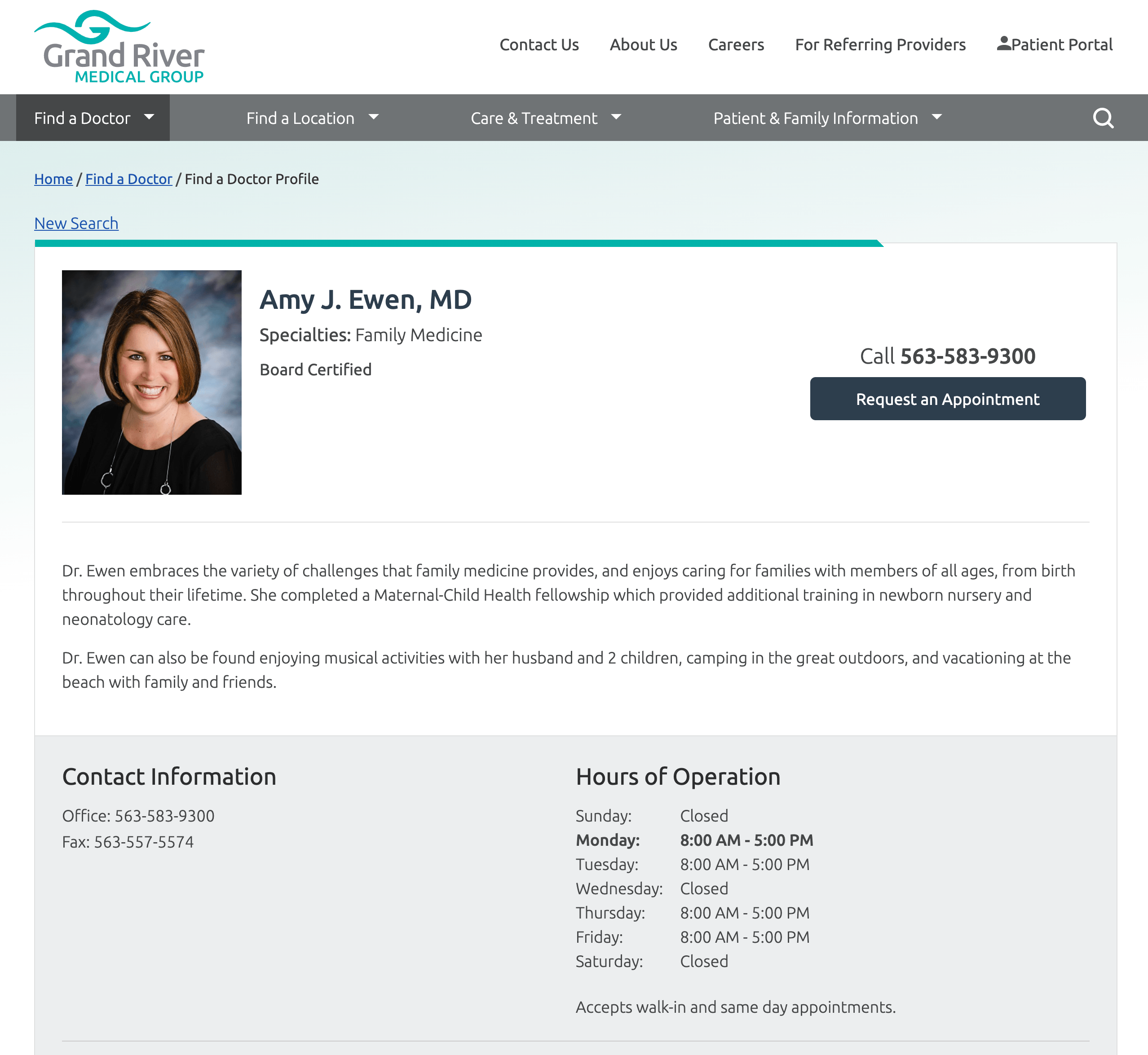
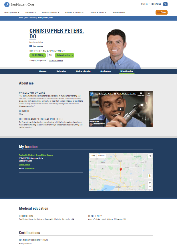
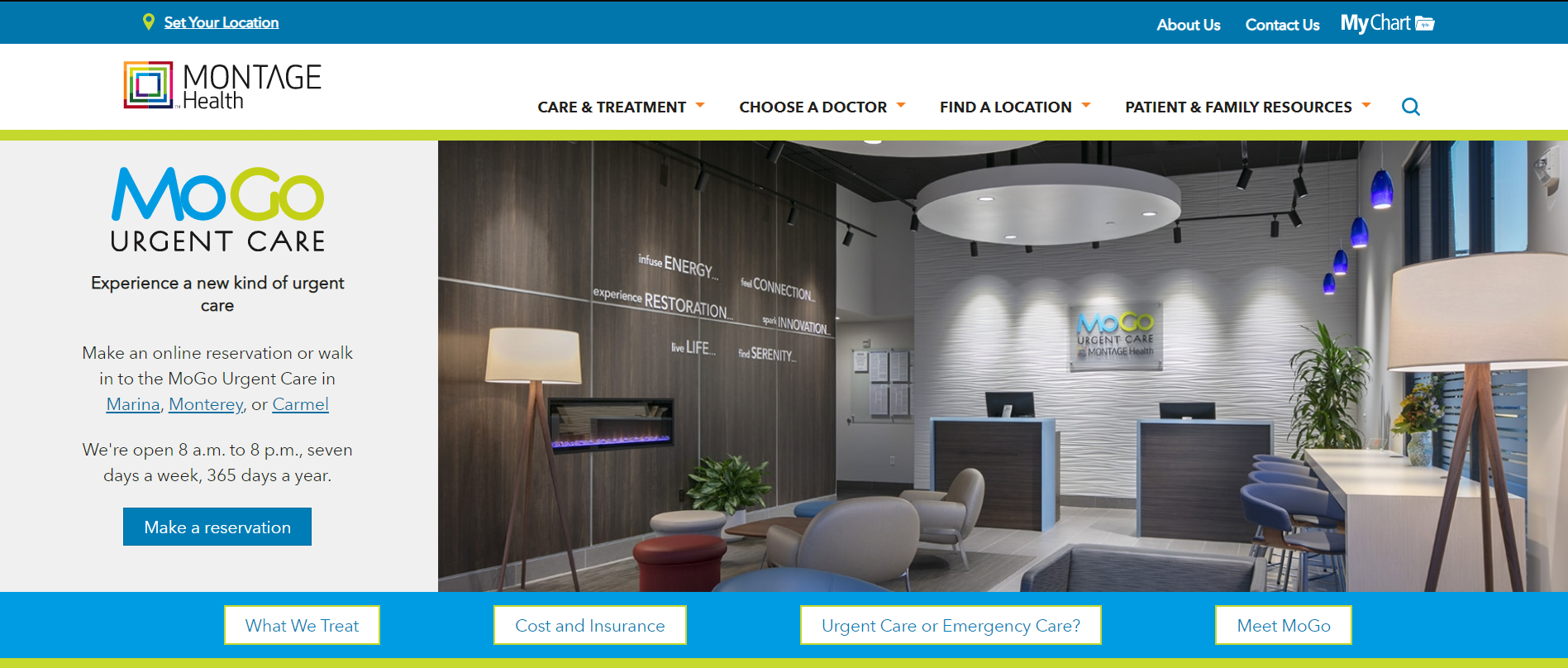
Tasked with making sure all seven entities still had emphasis and representation on the site while living cohesively within the Montage Health brand, Geonetric’s design team gave each entity a custom landing page and interior page where they could use their individual logos and deploy unique branding. For some entities, like MoGo, their network of urgent care clinics, their section of the site has a special but complementary design and tertiary navigation menu that cross-links as needed to interior pages in the section and across the site.

screenshot of MoGo landing page

Enhancing the online location strategy

Although all of the entities live within one sitewide, global navigation, it was important that each had a place to tell their own story. This required a thoughtful location strategy that could house more information than a standard single location profile. For example, Community Hospital moved from having its own 746-page website to a robust location profile that not only put the standard location information like hours, maps, and contact information at site visitors’ fingertips, it also gave the hospital a place to share its history, location-specific resources, and cross-link to services offered.

screenshot of Community Hospital's location profile

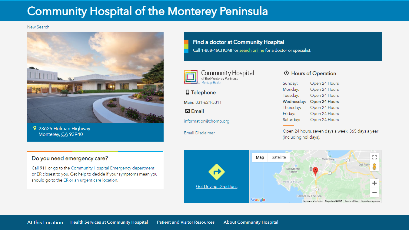
With location-focused copy critical to search engine optimization, all 55 of the location profiles Geonetric developed include Schema.org markup to help search engines recognize the content type. In addition, location-focused keywords are used in driving directions and other content to aid in near-me searches.

Writing user-centric copy

Montage Health enlisted the Geonetric writing team to create new, search-optimized copy throughout the site. Using the findings from interviews with Montage Health’s subject matter experts and in-depth keyword research, the content developers created new copy that answers users’ top questions, follows the patient journey, and adheres to proven web writing best practices. In total, the team developed 420 pages of new content for the Montage Health site, including:
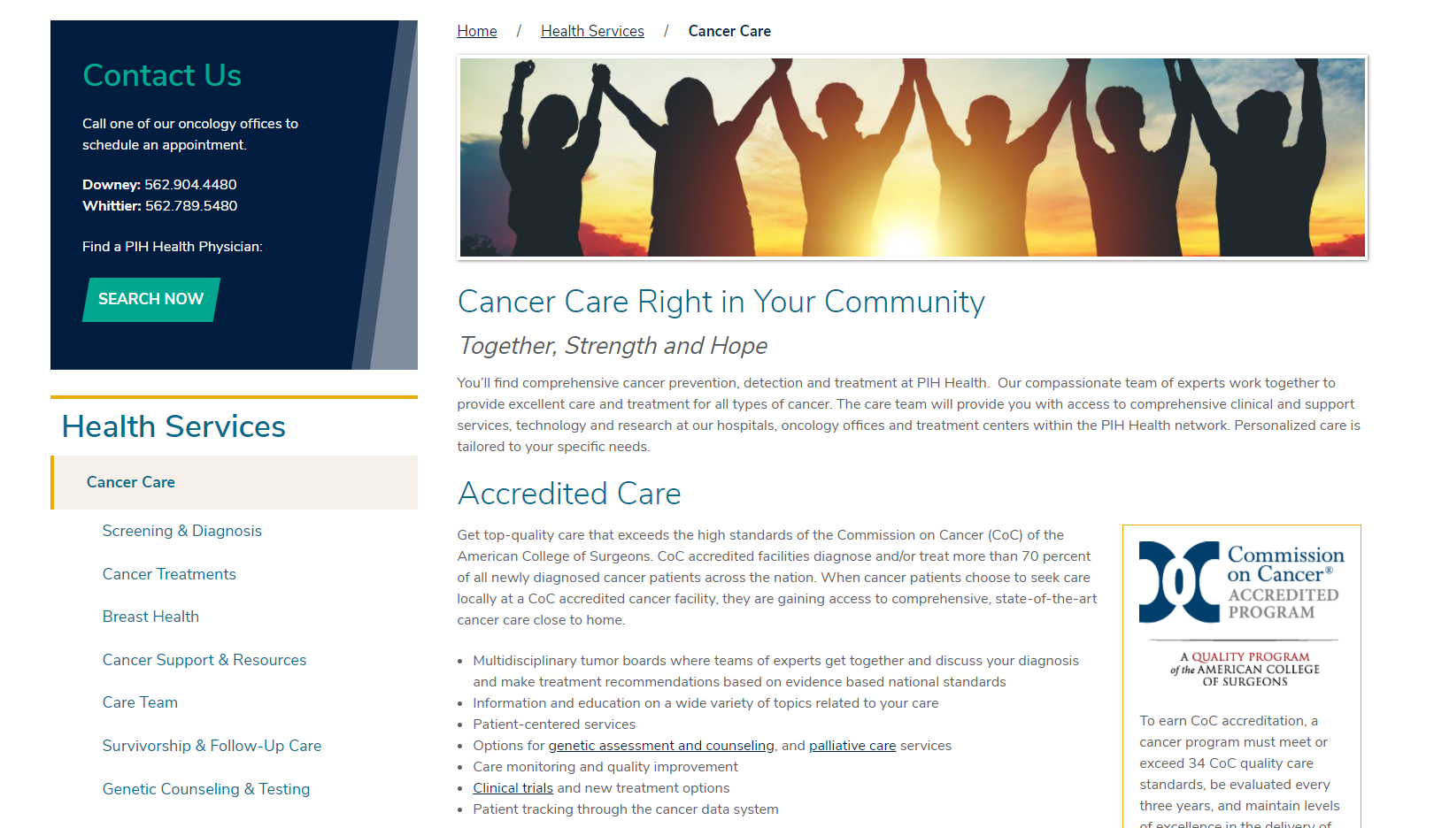
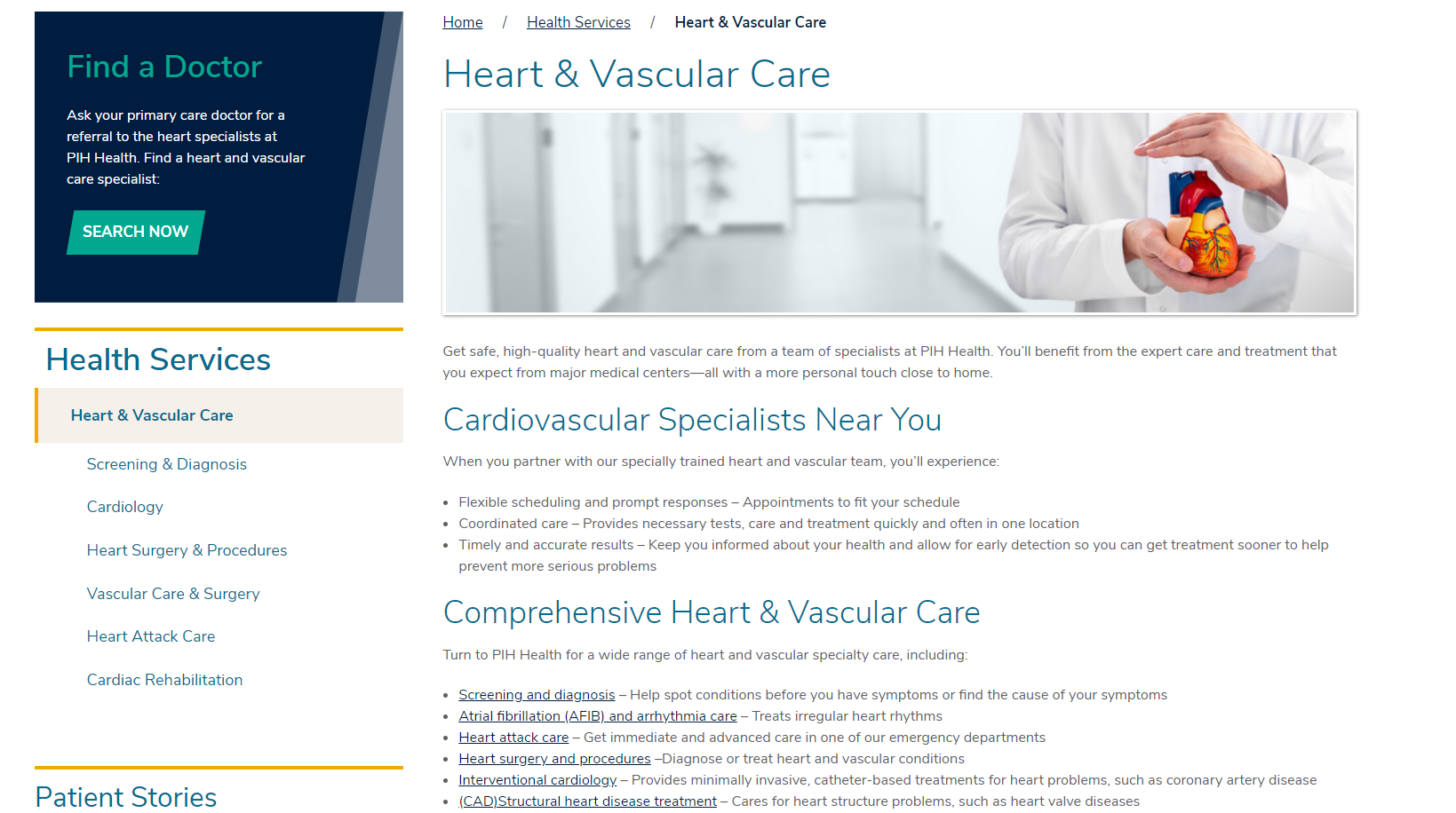
All content cross-links strategically, putting users on a path to finding services, locations, and providers.

In addition, Geonetric delivered content governance workshops for the Montage Health team, as well as recommendations related to their video and classes and events calendar categorization strategies.

Enjoying immediate results

The new site launched in May of 2021 and saw immediate improvements, including a 322% increase in traffic to the locations section on the new site (MontageHealth.org) when compared to the locations section on their previous site (CHOMP.org). Site engagement has increased with a 50% increase in pages per session, a 61% increase in average session duration and a 35% decrease in bounce rate. There has been a 261% increase in organic clicks to Montage Health and a 178% increase in organic search impressions.

New Cancer and Heart Web Copy Differentiates Growing Health System

PIH Health is a nonprofit, regional healthcare network headquartered in Whittier, CA, with three hospitals, a large multispecialty medical group and a robust post-acute care program. The organization has a large network of PIH Health physicians and more than 7,500 employees — and it keeps growing. With the recent acquisition of Good Samaritan Hospital, a 408-bed hospital in downtown Los Angeles, the organization’s network continues to build resources, expand coverage, and develop a sustainable model for delivering care in the area in the future.

With the acquisition, PIH Health wanted to reimagine its web presence and ensure the site tells a system-centric story in a consumer-friendly way. The organization partnered with their long-time agency, Geonetric, on the website redesign. The emphasis? Reimagined web content, particularly around the key service lines of cancer and heart.

Building the foundation for effective content

As part of the redesign, the Geonetric team reviewed the content inventories of both sites and analyzed them, provided consumer-friendly navigation label recommendations, and developed an overarching content matrix.

The team also revised the website style guide that then could be used by both Geonetric writers and PIH Health’s internal team to present a unified tone and voice throughout the site. This was particularly important as Good Samaritan Hospital content was woven in alongside PIH Health information.

In addition, keyword research for two priority service lines helped identify varied terminology used to search for specialists, medical conditions, and care services. This research was the basis for keyword portfolios, which the team relied on to develop user-focused content that answers searchers’ questions.

Early work on location strategy also proved invaluable. It helped the team to identify which services were delivered at the different hospital campuses. They then used that information to create user paths that connected service line content with location content, putting site visitors on the right track to receive care in the PIH Health network.

Set up with a solid foundation, the team took a deep dive into creating new content for the cancer and heart service line sections.

Sharing the story of accredited cancer care and comprehensive heart care

The new content enables PIH Health to highlight their ability to deliver comprehensive prevention, detection, and treatment right in the Whittier, CA, community. This includes calling attention to PIH Health’s Commission on Cancer (CoC) accreditation throughout the copy.

The Geonetric team wrote 11 new pages of new cancer content, with focused attention on readability and on-page optimization. New pages include Screening & Diagnosis, Cancer Treatments, and Survivorship & Follow-Up Care. The section takes a patient journey approach and meets patients where they are – regardless of if it’s prevention, diagnosis, treatment, or follow-up care.

screenshot of PIH Health's cancer care section
PIH Health’s new Cancer Care section

The Heart & Vascular section highlights the flexible scheduling and coordinated care patients receive at PIH Health. With 11 pages of new heart and vascular content, including new content on Heart & Surgery & Procedures and Cardiac Rehabilitation, the section is more robust and maps more closely with a heart care patient journey experience.

screenshot of PIH Health's heart and vascular page
PIH Health’s new Heart & Vascular section

Both sections of new content deliver on PIH Health’s goal of a consumer-friendly website experience and:

  • Incorporate actionable language that connects patients to the next step in their journey
  • Make it easy to take the next step by highlighting calls to action to drive user behavior
  • Meet readability and accessibility best practices with content written at a 9th grade reading level, matched to PIH Health’s unique community
  • Use a conversational and friendly tone consistently

Throughout, site visitors are reminded of the benefits of receiving care at PIH Health and the personalized approach the organization takes.

Driving traffic and engaging site visitors

Since launch, both sections are delivering. Compared to the same time frame last year, the Cancer Care section has seen a 702% increase in page views year over year with a 144% increase in organic traffic from 2020.

In terms of engagement metrics, the bounce rate for the Cancer Care section has decreased from 67% (2020) to 45% (2021). The page with the highest level of page views in the Cancer Care section is the Schedule Your Mammogram Today page, with 49% of the page views to the Cancer Care section. Data also show that key pages, such as Breast Imaging & Mammogram, are sending 50% of users on to related locations that offer mammograms, again focusing on PIH Health’s goal of connecting consumers with care options.

In addition, overall rankings for cancer-related searches jumped an average of 10 spots on Google’s results page.

For the Heart & Vascular section, the overall page views increased 228% year-over-year, with organic traffic increasing 181% year-over-year. The top pages in this section – the Heart & Vascular landing page, the cardiology page, and the surgery procedures page – are all driving measurable interactions. Most are going to a list of related providers, aligning with the patient journey and moving toward conversion.

Top Healthcare Brand Builds Awareness for Breast Care on Social and Streaming Audio Platforms

Wayne UNC Health Care is a nonprofit hospital affiliate of UNC Health, a leading national healthcare organization in North Carolina. Like most hospitals and health systems, Wayne UNC Health Care noticed a substantial decrease in preventative care in their community in 2020.

They turned to their long-time digital partner Geonetric to help them execute new ideas to keep breast health top of mind in their Goldsboro, NC and Wayne County communities.

Building awareness for monthly observances

To align with the breast cancer awareness month in October, Wayne UNC Health Care worked with Geonetric’s digital team to create a digital audio campaign that ran on popular music streaming, digital radio, and podcast apps, such as Spotify, Pandora, Stitcher, and iHeart Radio.

The campaign focused on the statistics that 1 in 8 women receive a breast cancer diagnosis in their lifetime – and listeners can be the one who detects it early with a mammogram from Wayne UNC Health Care. Audio ads, written by Geonetric, ran between songs, along with companion tile and banner creative to not miss the paid subscribers. Sharing real statistics that impact real women was an integral theme of the campaign, so it’s important to note that the creative used images of real, local women. This helped contribute to the overall success, as did coordinating offline efforts that included sidewalk decals and painting the downtown pink with matching campaign collateral.

audio ad for wayne unc health
Examples of ad creative from audio campaigns.

Wayne UNC Health Care ran this audio as part of a larger, integrated digital campaign, supporting messaging the target audience might be hearing through other channels. Adding audio to the marketing mix was important to Wayne UNC Health Care to broaden their exposure and reach consumers in ways other digital channels can’t, such as when they are driving or exercising.

In addition, Wayne UNC Health Care found that advertising on popular radio and streaming platforms is an effective way to reach target audiences while still keeping detailed analytics and tracking – something that’s hard to do with traditional radio advertising.

Promoting new, innovative technology

To promote Wayne UNC Health Care’s new SmartCurve™ paddle, Geonetric developed creative for the campaign that ran on Facebook and Instagram, the local news website, and a digital billboard in the Goldsboro area.

Geonetric managed the social campaign, identifying the demographic and geographic target audience, creating ad copy and design, optimizing and testing, and setting up tracking using both Facebook Pixel and event tracking in Google Tag Manager.

Since social media campaigns are an effective way to relate to your audiences and inject some personality into your ads, the creative for this campaign focused on fun. The ads took a more lighthearted approach to mammograms, speaking directly to the target audience and using more playful colors, images, and words. While the ads still matched Wayne UNC Health Care’s brand voice, they did allow the organization to have a bit more fun with the content, while using A/B testing to swap out creative regularly to avoid ad fatigue.

The campaign generated lots of engagement and interest, and in just 11 weeks it generated enough mammogram appointments to deliver a total ROI on the campaign of 243%.

Focused campaign and messaging efforts

Since part of the goal for both campaigns was awareness building, it’s important to note that over the course of both campaigns there was a 124% increase in mammogram appointments compared to the previous period. Looking at October (Breast Cancer Awareness month) year over year, there was a 278% increase in mammogram appointment requests – even in a pandemic!

User Experience Audit Sets Medical Center Website Redesign Up for Success

Mary Greeley Medical Center is a 220-bed regional hospital that provides healthcare to the residents of a 13-county area in central Iowa. While it serves many nearby rural communities, it also competes with larger healthcare organizations in the Des Moines metro area. Their marketing team knew that to retain and attract patients, their website needs to deliver an online experience that meets or exceeds the experience of much larger competitors.

When the medical center was approaching an upcoming redesign with their digital agency Geonetric, they decided to start with a user experience audit. It helped identify areas to capitalize on to better engage site visitors – particularly mobile users.

Deep dive into analytics

Using Google Analytics, scroll tracking, heat mapping, click mapping, and user survey feedback, the Geonetric team analyzed how site visitors arrive at the site and interact with its content and functionality there. The team evaluated user paths from the home page to high priority areas, how visitors use navigation and search, as well as engagement and conversion data on location, services, and provider pages.
The findings from the audit revealed priority opportunities to:

  • Improve the mobile user experience
  • Implement a system-wide approach for location content
  • Strategize labeling and their A to Z services listing for more clarity
  • Make calls to action more prominent for both desktop and mobile users

There were additional recommendations to refresh content to make it more user-focused and improve accessibility to comply with WCAG 2.0 guidelines for color usage.

Armed with these recommendations and ideas, the Mary Greely and Geonetric teams got to work on the redesign.

Redesign focuses on more modern user experience

The new website is built on the VitalSite content management system and marketing platform and delivers an updated, modernized experience. Through a hero banner video, eye-catching icons that highlight top tasks, and large fonts that promote the organization’s free, 24/7 First Nurse phone line, priority information is front and center above the fold. The design was also WCAG 2.0 compliant at launch.

  • Screenshot of Mary Greeley Medical Center homepage prior to redesign.

The new main navigation features expandable mega-menus with dropdowns, icons, and built-in search, helping users quickly find what they are looking for both priority service lines and providers. The new information architecture and menu items are optimized based on engagement metrics and to avoid redundancy.

Mary Greeley Medical Center Drop Down Menu

The site also boasts refreshed content and internal section structures that reflect their UX audit findings, content strategy best practices, and the organization’s strategic communications goals. Mary Greeley’s writers received healthcare and web writing training from Geonetric’s content experts, as well as a round of feedback on new copy they’d written according to the training, giving them an opportunity to practice their new skills.

In an effort to make tracking and more iterative site enhancements a priority, Mary Greeley and Geonetric created a new Data Studio Dashboard where the Mary Greeley team can keep a watchful eye on numbers that align with their KPIs – particularly around acquisition, engagement, demographic and traffic channels.

Improved results across the board

Since launch, the site has enjoyed impressive results, including:

  • A 22% increase in overall sessions
  • A 15% increase in sessions to the providers section
  • People continue to turn to you as a source of truth with users and new users increasing by 25% and 28%, respectively
  • Engagement overall in the services section is now higher than industry averages
  • Desktop and mobile traffic has increased by 22% and 23%, respectively

In addition, the site received an honorable mention award from the 2020 MarCom competition in the Website-Medical category.

Redesign Helps Health System Stand Out in Competitive Market

Virginia Hospital Center (VHC) has provided exceptional medical services to the Washington, DC metropolitan area for more than 75 years. With intense competition in the area, VHC wanted to update their digital presence. It had been more than 15 years since the organization redesigned or upgraded platforms, and the site wasn’t delivering an optimal experience for mobile visitors or integrating with the MyVHC Epic patient portal.

That’s why VHC turned to Geonetric to help build a site that better represents their brand, delivers an intuitive user experience for both desktop and mobile visitors, and offers features and functionality that surpasses the competition.

Telling the story of VHC through design and content

One of the main goals of the new site was to align the web with existing marketing materials to create a cohesive experience and improve brand awareness. Since it had been 15 years since the site had been refreshed, it was important to establish a new online presence that better reflected the award-winning and top-notch services patients receive at VHC.

VHC’s traded in a copy-heavy homepage for a simplified design that uses an accessible color palette consistent with existing marketing materials, images with a slight gradient to create a feeling of warmth and create unity across the site, and clear icons that draw visitors in. A large hero image promotes VHC’s tagline and the minimalist design allows colors to stand out against the mostly white background. For example, the Find A Doctor search is prominently displayed on the homepage with the blue background color capture visitors’ attention and aiding in increased patient volume by putting health consumers on a direct path to getting care.

The unique treatment to the letter V in VHC’s logo is used to break up sections on the homepage, reinforcing the brand and helping to draw the user’s eye down the page to additional information. Small micro-interactions are used on the homepage, such as boxes that appear on hover or arrows that animate on hover. These add movement and interactivity to the design, gently encouraging users to click and explore more.

Previously VHC had a separate site for mobile, creating a disconnected experience. The new site is responsive and an important step forward as the organization focuses on engaging mobile site visitors.

It was also important to ensure the site is a useful resource where users can easily find information. This was accomplished through both design and information architecture. For example, the eye-catching quick links panel on the homepage uses icons to highlight top user tasks, making it simple for visitors to pay bills, access health education, log in to MyVHC, and find a job.

Geonetric writers worked with VHC to identify what types of content updates were needed for each service line section by launch. For six high-priority sections, Geonetric worked with VHC subject matter experts to create new, robust website content about programs, services and key differentiators. For another 36 sections, Geonetric revised existing content to bring it in line with current web writing best practices and the organization’s brand updates.

Both approaches included writing metadata to improve SEO, developing calls to action to support conversions, and ensuring content is readable, accessible, and patient-focused. This two-tiered approach to content development meant that VHC was able to launch its website with crucial content updates while staying within the project’s timeline and budget.

New platform delivers key features and functionality

Moving to the VitalSite content management system (CMS) helped VHC quickly catch up to software, functionality, and user experience best practices. Since the CMS is built for healthcare systems the Find a Doctor, Locations, and Services directories met all of VHC’s needs out of the box, with engaging provider and location profiles that have Schema.org built-in. Key content is cross-promoted throughout the site via panels and SmartPanels, so VHC Physician Group providers automatically show up on service line pages. The Classes & Event directory helps VHC promote numerous classes, support groups, and community events.

Building on VitalSite also meant VHC’s site is mobile-ready with a responsive design, fast-loading thanks to lightweight code, and delivers an inclusive experience, being WCAG 2.0 compliant at launch.

Highlighting the Mayo Clinic connection

VHC is a proud member of the Mayo Clinic Care Network, a national network of independent healthcare organizations. The new design helps bring attention to that partnership through the navigation, a logo in the footer, as well as through panels and callouts on key pages. Geonetric was mindful of adhering to Mayo Clinic’s brand standards.

Adding the Mayo Clinic Health Library to the site also helped solidify that connection, and gives VHC site visitors access to extraordinary expertise from one of the world’s leading medical centers, all while enriching VHC’s online health resources.

Increasing engagement, traffic across the board

Since its launch, VHC is enjoying numerous improvements. Sessions have increased by 11.7%, users have increased by 13.0%, and page views have increased by 28.8%. When looking at engagement metrics, pages per session increased by 15.3%, average session duration has increased by 5.7% and bounce rate has decreased by 37.5%, which is 11% lower than the average bounce rate in the healthcare industry.

VitalSite’s Dashboard presents important high-level analytics data such as total site sessions and session breakdowns, top pages including providers and locations, module traffic and engagement, along with form conversions and events, and mobile vs. desktop usage. This helpful feature allows VHC to easily monitor high-level metrics.

The site improvements have also made an impact on traffic acquisition. Since launch, organic search traffic has increased by 14.7% when compared to the previous period and accounted for nearly 41,000 total sessions. Direct traffic has increased by 19.1% when compared to the previous period. Referral traffic increased by 38.0% when compared to the previous period.

Digital Employee Communication Tool Delivers Inspiration, Engagement

Cape Cod Healthcare (CCHC) is the leading provider of healthcare services for residents and visitors of Cape Cod. CCHC has two acute care hospitals, with more than 450 physicians, 5,300 employees, and 1,100 volunteers.

Communication with their care team, staff, and volunteers have always been a top priority. The organization had a print publication, The Pulse, which was mailed to staff, as well as emails that were sent from leadership teams and departments as needed.

Both communication vehicles got the word out but left opportunities for improvement. The print publication was costly to produce and made it difficult to move quickly on timely topics with the production schedule. With department and leadership emails, the marketing team wasn’t always part of the messaging. There was no analytics to track engagement, and content “died on the vine” with no easy way to revisit the information later.

When considering how to deliver internal news and information better, the organization considered their intranet, but it wasn’t the right place. It was more focused on being a document repository and less focused on employee engagement and communication. It was also important to the marketing team that employee content was available outside the network so it was more easily accessible. The team recognized this need even before the pandemic, but it became even more important once COVID-19 hit.

To accommodate their needs, CCHC looked to their digital partner, Geonetric, to create a new platform and leverage the strategy and design behind the health system’s popular Cape Cod Health News content hub for a new, more robust, digital version of The Pulse.

Building on a sophisticated foundation

It was essential to the CCHC marketing team to establish a robust content strategy which centered on aligning digital content on The Pulse to key organizational priorities. That meant they needed to use the platform as an amplifier of key messaging. The CCHC team defined strategic objectives for The Pulse which were translated into content categories aimed to build a patient-centered, healthy, diverse and inclusive culture. The CCHC team partnered with Geonetric team to implement a sophisticated framework and taxonomy to organize and prioritize content to support an employee-centered content journey.

The Pulse site was built on the VitalSite content management system and leverages a similar design and build as CCHC’s public-facing news hub on their main website. The Pulse showcases a featured story, the ability to subscribe to the newsletters, submit a story idea, and search by themes, topics, or a general search.

Launching during a pandemic

When The Pulse launched and CCHC sent the first all-health system newsletter was in June of 2020, Massachusetts has just passed its first COVID-19 peak. The initial edition shared a timeline of pandemic on the Cape, photos of employees and the community, and an inspirational message from their CEO about adjusting to the organization’s new normal.

screenshot of the pulse article depicting cape cod's healthcare heroes
The Pulse article showcasing images of Cape Cod’s Healthcare Heroes.

Over the months, the CCHC team has created many different types of content for The Pulse, including slideshows, videos, and articles, and see how it performs. One of the most popular content types is their ‘10 Questions with…’ feature. Created to help meet the goal of focusing on employees at all levels of the organization, not just physicians, this interview-style article asks different team members to answer ten questions about themselves, their work history, and their favorite pastimes.

screenshot of pulse interview with Patty Vigneau
The Pulse article showcasing 10 questions with Patty Vigneau.

The Pulse has also been instrumental in CCHC’s launch of EPIC as part of the organization’s large scale transformation vision. Although the EPIC launch has its own microsite, The Pulse has been a critical channel to push messaging and training to teams.

Engaging teams on and off-campus

Since its launch in June of 2020, engagement with The Pulse continues to grow. The newsletter emails have seen open rates as high as 50%, with an average of 43% across five-months. There has also been a 23% unique click rate and 17,315 total page views. Every month, the site continues to see improvement in sessions, page views, and pages per session. Having the site live outside the organization’s intranet has also likely continued to those numbers, as employees can access the content off-campus.

New Website Helps Physician Group Connect Community with Providers

Home to more than 450 providers, Acclaim Physician Group (Acclaim) is a partner with JPS Health Network, a regional and national leader serving more than 212,000 unique patients in Tarrant County. Only three years old, the growing physician group had outgrown their website and needed to deliver better functionality and a better overall user experience to their patients and site visitors.

After vetting potential partners, Acclaim selected Geonetric and the VitalSite Essentials content management system (CMS) to reinvent the provider group’s digital experience.

Laying a stable foundation

With a WordPress site that didn’t match Acclaim’s brand – and worse, wasn’t stable and risked downtime with every change – Acclaim was excited about a healthcare-specific CMS and custom design.

VitalSite CMS came with all the functionality Acclaim needed now and in the future, including a provider directory that integrates with popular credentialing systems, a must-have feature to showcase a growing provider network. Through an API integration, the online provider directory will always be accurate, becoming a source of truth for provider data. The provider directory also features a robust search feature and allows each provider to have their own profile page, showcasing areas of interest and specialties.

The services and locations directories also offer all the features and functionality Acclaim was looking for – including the ability to showcase Google maps and cross link to providers from location profiles and service line pages.

Other benefits of the new CMS and updated design delivered immediate benefits to Acclaim, including:

  • A responsive design that works well on all devices
  • Faster loading speeds that help with search rankings
  • The addition of an easy-to-update alert panel, which proved essential to communicating with the public during the COVID-19 pandemic

Writing content that connects at the right level

Knowing how important engaging, accurate content was to the new site, Acclaim enlisted the help of Geonetric’s content development team. The writers started by interviewing service lines leaders, providers, and administrators to learn about Acclaim’s unique differentiators. The team then developed 32 new service line content pages, all written to follow writing for the web best practices. The team also took into account the reading level of patients and potential patients in Acclaim’s service area, ensuring site visitors could easily understand copy.

Increasing engagement and search results

Since launch, the site has seen a 38.1% increase in users and a 68.1% increase in pages per session. The site is also enjoying a 58% improvement in clicks from Google, with 66.3% of the total traffic from organic. In fact, organic traffic has increased each month since the May 2020 launch.

Acclaim is also enjoying a 31% lower bounce rate than the industry average for their provider section – the part of the site that is key to bringing new patients into the group.

Medical Group Improves Digital Experience With New Site, New Content

Grand River Medical Group was founded in 2016 when three clinics merged to ensure the Dubuque, Iowa community continued to have access to high-quality medical care. When the three physician groups merged, the website no longer represented the growing organization, which continues to add more providers and facilities each year.

That’s why Grand River Medical Group turned to Geonetric and the VitalSite Essentials content management system (CMS) to help this new and evolving system build a strong digital foundation.

Finding a CMS built for medical groups

After vetting potential partners and platforms, Grand River Medical Group decided on Geonetric’s VitalSite. The healthcare-specific CMS comes with all the functionality Grand River Medical Group needed out of the box.

The Provider Directory offers a robust search feature that allows users to search by name, city, gender, specialties, ZIP code, and radius. Each provider also has a profile that shares images, contact information with a map, where they practice, and the ability to request an appointment. The helpful A-Z link in the Services Directory and the mega menu featuring top service lines make it for site visitors to find the care they need.

Best of all, content on the site is cross-promoted through SmartPanels, making it easy for potential patients to stay on a path to conversion, regardless of how they enter the site.

screenshot of provider profile
Example of Grand River Medical Group provider profile

In addition to the directories, the site offers many enhanced features, including:

  • Responsive design that provides an excellent user experience on all devices.
  • Streamlined main navigation and secondary navigation with quick links and icons that direct site visitors to top tasks.
  • Eye-catching calls-to-action that encourage conversion and are easily managed through panels.
  • A global alert panel that was easy to activate when the COVID-19 pandemic hit soon after launch.

Developing user-focused content

Grand River Medical Group also took the redesign as an opportunity to review and develop new content. This was the first time the service departments intentionally reviewed what content was out on the web. Geonetric performed a content inventory and identified gaps in service lines not represented.

Geonetric’s expert writers also provided Grand River Medical Group with a content template that provided a structure based on best practices for what copy should go on a service page and in what order. The team also reviewed a page of content and provided recommendations for improvement.

Engaging site visitors and beating industry averages

Since launch, the site has seen a 13.4% increase in users and an 18.2% increase in sessions to services content. The new content and faster site speed have translated to a 67.5% improvement in average SERP click-through rate and a 30.6% improvement in average Google ranking.

When comparing the site to industry averages, Grand River Medical Group’s site has longer session duration by 9 seconds and longer provider session duration by 1:12 minutes. The new site also enjoys a 15% lower overall bounce rate and a 27.8% lower bounce rate for providers.

New CMS Platform, Responsive Design, and Content Set the Stage for Engaging Online Experience

When ProHealth Care decided it was time to move to a different CMS and redesign their website, they turned to a former partner and former platform. The Waukesha, WI-based health system and Geonetric worked together in the past, but amicably parted ways when the ProHealth Care team decided to bring web ownership in-house and partner with a local company. While that worked for a while, ProHealth needed a thought leader and partner well versed in the healthcare industry to help bring its vision for ProHealthCare.org to the next level and enhance the user experience.

Moving back to a healthcare-specific content management system

ProHealth Care wanted to create a new site that offered more transactional and interactive elements, offered a mobile-first format, as well as improved accessibility. Returning to the VitalSite CMS achieved all of those goals for the system.

The new site, which launched in September 2019, features improved navigation and a dynamic homepage focused on access to care. The site offers integration with Epic and Experity Health’s online reservation system, and allows consumers to schedule provider appointments, check wait times and make urgent care reservations, and schedule virtual urgent care visits.

Being built on a healthcare-specific CMS means the ProHealth Care site automatically comes with powerful provider, location, service, and class and event directories. ProHealth Care built on the out-of-the-box functionality, developing custom provider profiles that feature engaging photos, videos, and outline the providers’ philosophy of care, locations, medical education, and may include an Epic widget for appointment scheduling. The provider directory easily allows ProHealth Care to note which providers are accepting new patients as well as list accepted insurance, two elements that aid site visitors in selecting a new provider.

screen shot of provider directory page
Example of ProHealth Care provider profile

The new site also takes a mobile-first approach, with every page accessible for mobile users instead of a limited amount. Since the site is responsive, it provides an optimal experience for all users, regardless of device being used.

The ProHealth Care team also appreciates having development and stage sites back again, allowing them to test changes and enhancements before pushing updates to the live site.

Leveraging deep healthcare writing expertise

As part of the project, the ProHealth Care team partnered with Geonetric’s expert content strategists and writers to refresh the site’s content and optimize it for organic search. The new content reflects the community-based health care system’s brand and values – it’s approachable, readable, and focused on patients and family benefits.

The team began by developing a full content matrix, a page-by-page blueprint for the site. Geonetric’s skilled content writers developed 229 pages of new content, including pages for 37 services, some of which previously had no presence on the site. Service line sections are thoughtfully organized to follow a typical patient journey, so it’s easy for site visitors to find the information that meets their needs.

The content team also wrote content for dozens of support pages, such as “Ways to give” and “Patients and families.” The team also wrote page titles and meta descriptions for each page following best practices for search engine optimization.

To help meet ProHealth Care’s goal of streamlining site content, the Geonetric team reduced the number of pages by nearly 50%, making it easier for visitors to find the information they are looking for with fewer clicks.

The content team also integrated ProHealth Care’s popular “ProHealth Minute” videos on relevant pages throughout the site.

As copy was completed and approved for sections of the site, the ProHealth Care team was instrumental in taking it and building conversion-focused pages with thoughtfully placed calls-to-action, making the site come to life.

Meeting compliance guidelines and enjoying impressive results

At launch, ProHealth Care’s new site was WCAG 2.0 compliant, providing an optimal user experience to site visitors of all abilities. Geonetric’s expertise in this area was highly valued by the ProHealth Care team during its partner selection process as it lacks a dedicated digital team – or even a team member.

The ProHealth Care team is excited about the site’s performance. In the first few months post-launch overall traffic is more engaged, with site visitors spending 29% more time on site year-over-year and mobile users averaging 38% more time on site year-over-year. In addition, overall page views are up 11%, with average pages per session up 24% and bounce rates down 41% year-over-year, with site visitors staying longer and becoming more engaged with their content.

With searchers relying more on location-based queries, such as “urgent care near me”, ProHealth Care’s location pages have seen a 12% increase in page views and a 7% increase in entrances, correlating with the organization’s shift in content strategy to break out urgent care and emergency department locations as separate location profiles from their parent organizations. This illustrates that more people are going to these pages from within the ProHealth Care site and landing directly on these pages, which means they’re aligning better with location-based user intent.

Organic search traffic to the site is up 19% year-over-year, showing the positive effect of investments in a more robust SEO strategy.

Investing in digital after launch

With an engaging new site to drive traffic to, the ProHealth Care team also partnered with Geonetric for ongoing digital marketing support. The initial focus was on building out service line Schema.org and performing keyword research around site search. Another important aspect of the work was focused on business listings. The Geonetric team partnered with ProHealth Care to clean up existing listings and build other standard listings across multiple platforms from scratch. They also helped manage the process of adding photos, added UTM parameters for tracking, and perform monthly updates.

ProHealth Care also invested in several pay-per-click campaigns, enlisting Geonetric’s digital experts to update digital ads and optimize their investment by introducing some new keyword strategies. The team updated copy, reworked ads to be more conversion-focused, and revised keywords for campaigns including virtual care, urgent care, and find a doctor.

Although the COVID-19 pandemic forced the team to pause some campaigns and reallocate resources, ProHealth Care is still seeing impressive results from its investments. Since the first upload into Google My Business for ProHealth Care, they have had over 100,000 actions on ads, including clicking on phone numbers. Google My Business and Bing have sent more than 20,000 visitors to their site and those users are on the site for 2:02 minutes and visit 2.68 pages per session – both statistics higher than industry averages.

New Intranet Gives Employees Access to Important Information On-campus and On-the-go

With humble beginnings traced back over a century ago to a seven-bed hospital, Holzer Health System has grown into a multi-facility system that serves 21 locations throughout southeastern Ohio and western West Virginia. The number of providers and staff have grown over the years, too, and the system now has over 160 providers and over 2,400 total staff.

That growing team depends on the health system’s intranet to access important documents, get timely updates, and access third-party tools needed to deliver patient care. Their SharePoint site wasn’t performing as needed. Like many intranets, the information architecture and homepage content organization had grown unruly, making it hard for users to find tools and documents they need. Plus, the backend was difficult to navigate and update, making it hard to improve that frontend user experience. Employees’ growing reliance on different devices also created a challenge, as the current intranet wasn’t responsive.

Holzer Health System’s marketing and I.T. teams decided it was time for a change.

Leveraging a CMS system they know and love

For a quick fix, Holzer Health System turned to their digital partner, Geonetric, to develop an employee home page on the public site so team members could get information and event updates quickly from their mobile devices.

Building on the success of this page, Holzer Health System began building an entirely new intranet on VitalSite – the same content management system (CMS) used for their public site. The marketing team was familiar with VitalSite and knew it was easy to use, giving them confidence it would be easier to maintain the new intranet.

Plus, the CMS came with all the modules and integration the health system needed – including forms and documents, calendar and events, site search, SmartPanels, eCards, a newsfeed, and active directory integration – which allows the system to deliver personalized experiences on the site based on users’ roles.

Depending on content strategy and design expertise

By partnering with Geonetric, Holzer Health System was also able to rely on the agency’s designers and content strategists to design an intuitive user experience for their employees.

As part of the content strategy, Geonetric performed an employee-wide survey to help prioritize what content and functionality users really needed. The survey focused on what was or wasn’t working with the previous intranet.

The results of this survey helped guide information architecture and labeling, based on the needs of the users and using terms they understood and used. The survey results guided information architecture recommendations that included a primary navigation dedicated to organization information, documents and resources, education and training, and benefits and HR and a secondary navigation that puts quick links like phone book, the on-call list, and the cafeteria menu at users’ fingertips. It also helped to relabel navigation items to match the words employees used in their survey to make it easier to understand where to find the tools they need.

The survey also helped to provide priorities the content strategists used to deliver homepage recommendations to help make the homepage of the new intranet as effective as possible for all users. Users mentioned roadblocks and points of frustrations in their comments in the survey, which was leveraged to make recommendations for an easier to use, redesigned intranet. One of those roadblocks was confusion and frustration with multiple forms and outdated documents, something that could be streamlined with an easier to manage intranet CMS moving forward.

The design builds off of the public website templates as well as the employee-facing page on the public site and also included some updates to the design for easier use on the intranet. It features a customizable rotating banner and also has a custom drop down menu. The new intranet is responsive, delving an optimal user experience on all devices and it also met all WCAG 2.0 accessibility guidelines at launch. It also provides a much more visually appealing and friendly opportunity to access the materials that employees need every day for their work.

Launching at critical time

The new intranet went live in early April, just as the COVID-19 pandemic was sweeping the country. The new banner was quickly updated with critical employee information, and was easy to update as the pandemic unfolded.

Holzer Health System’s previous intranet didn’t have analytics so there aren’t any year-over-year comparisons. Since July 2020, the new site has had over 6,800 users and 41,263 sessions, for an average of 5.98 sessions per user showing adoption of the platform. There have been 79,000 pageviews with an average session duration of 2:45. There have been over 2,000 total file downloads.