Website Redesign Inspires Confidence

East Tennessee Children’s Hospital is the only comprehensive regional pediatric center in Tennessee accredited by the Joint Commission. The Knoxville, TN-based organization is dedicated to children and ensuring they get the best possible healthcare in a family-centered setting. When patients and their families come to East Tennessee Children’s Hospital they receive superior acute, serious, and specialty care in a unique environment. Large-scale murals, fish tanks, and three-dimensional art installations greet patients and visitors at every turn, creating an atmosphere of inspiration.

When it was time for East Tennessee Children’s Hospital to redesign the organization’s web presence, it was important to the team to bring that feeling to the web. They needed a digital partner who would get to know their organization at a personal level and create a plan that not only delivered a new site with an intuitive user experience and improved functionality, but also brought their unique, thoughtful brand to life. Together East Tennessee Children’s Hospital and Geonetric built a site that aims to ensure site visitors leave the web session with the same feeling of hope and confidence they do leaving an East Tennessee Children’s Hospital facility.

Choosing a content management system (CMS) to support a vital regional resource

East Tennessee Children’s Hospital had outgrown their website. The site lacked much-needed functionality, such as a location directory. There was also an opportunity to improve the provider and service listings – especially considering East Tennessee Children’s Hospital serves as a community resource for 16 counties in East Tennessee, Southeast Kentucky, and Southwest Virginia. With a website that is truly a resource hub for pediatric services across a large geographic footprint, East Tennessee Children’s Hospital needed a content management system that made managing and presenting complex service, location, and provider data easier. That’s why East Tennessee Children’s Hospital chose Geonetric’s VitalSite.

Their new site, which launched in February 2020, provides East Tennessee Children’s Hospital with sophisticated provider, location, and service directories. Using analytics and heat mapping to evaluate how users navigated to information, East Tennessee Children’s Hospital and the Geonetric team made data-driven decisions around information architecture, dynamic content panels, CTAs, and directory search and A-Z listings to ensure site visitors can easily find the provider, program, or location they need.

Additional features of the site include HIPAA-compliant online forms through Formulate, integration with Kids Health content library, and flexible campaign templates that allow the East Tennessee Children’s Hospital team to easily create landing pages for popular events such as the Fantasy of Trees.

Telling a story through design

East Tennessee Children’s Hospital expressed that the new design needed to convey that this is a hospital where your child is going to feel like a kid while visiting. The design also needed to represent the high level of expertise at East Tennessee Children’s Hospital and ensure the site visitor felt like their family would be in good hands.

Geonetric achieved these goals by considering the recommended content and page hierarchy and using custom, brand-driven elements, such as East Tennessee Children’s Hospital’s bright, inviting color palette. The expert design team also included purposeful micro-interactions in key places on the site, using hover styles on the navigation and buttons throughout the site.

East Tennessee Children’s Hospital’s unique design is wrapped in a responsive, fast-loading site that meets WCAG 2.0 guidelines, all important elements to designing an optimal user-experience.

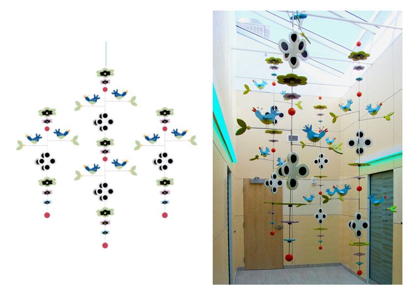
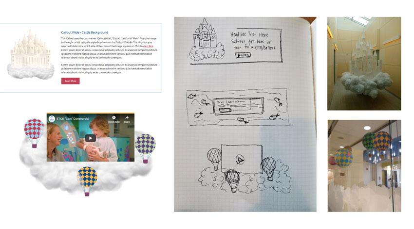
The real showstopper belongs to the illustrations. Throughout the website you’ll see custom graphics unique to East Tennessee Children’s Hospital, bringing key artwork at the hospital to life on the web. These include a popular mobile, the floating castle, a fish tank, and hot air balloons.

mobile illustration of birds
Left: Web illustration of popular mobile. Right: The real art installation at East Tennessee Children’s Hospital
Castle hot air balloon illustrations
An inside look at the process of bringing in-person art installations to life on the web

Engaging site visitors and making the marketing team’s life easier

Since launching in February 2020, the East Tennessee Children’s Hospital team is enjoying the site and the flexibility and control the new CMS gives them.

In the first three months after launch, engagement has improved. The bounce rate has dropped 22.61% site wide and mobile specifically has had a 16.66% improvement in bounce rate. Pages per session have increased 1.70% and average session duration has increased 12.70% from 1:31 to 1:43.

Design Theme and Secure Hosting Set Foundation for Enhanced Digital Experience

When Silver Cross Hospital, New Lenox, IL, reached out to Geonetric, they had seven sites built on different platforms including Joomla, WordPress, and Drupal. The hospital was experiencing numerous security issues with their hosting, particularly with their online forms. As a healthcare organization, ensuring sensitive information is secure is a top priority — so Silver Cross Hospital turned to Geonetric and their proven experience in domain migration to help get the organization into a secure environment.

Geonetric’s expert project management and I.T. teams got to work creating a transition plan, carefully navigating the needs of multiple stakeholders at the hospital to ensure everyone was on the same page and comfortable with the migration strategy. Geonetric copied one site at a time, making all necessary updates to the platform. Then, each site underwent thorough testing by both Geonetric’s quality assurance team and the Silver Cross Hospital team. In addition, 16 forms were rebuilt in Geonetric’s secure, HIPAA-compliant form builder, Formulate. The transition for each site was seamless, with Silver Cross Hospital’s users experiencing minimal downtime with the Domain Name System (DNS) transfer to the copied site.

Building on a secure foundation

With their sites in a stable, safe environment, the Silver Cross Hospital team and Geonetric then turned to consolidating multiple sites into one platform and creating a new, system-forward design and content strategy that provides a better experience for mobile users. Moving to a responsive site was a top priority, as their previous sites had separate mobile pages, which didn’t deliver a seamless experience to their growing number of mobile users.

The new site is built on the VitalSite content management system (CMS) and the organization took advantage of a pre-built design theme — created to help organizations bring their sites to life efficiently and effectively. Built based on decades of design, development, information architecture, and content strategy best practices, VitalSite’s design themes are responsive, fast-loading, and accessible out of the box, so Silver Cross Hospital was immediately brought up to date with a modern site that meets WCAG 2.0 guidelines. The selected theme was modified to support Silver Cross Hospital’s brand, creating a design that reflects the organization’s unique approach to care.

VitalSite comes equipped with robust functionality, including a sophisticated provider directory. Silver Cross Hospital was excited to move their providers into the directory on their main site, instead of sending visitors to a third-party site. This allows the organization to keep that valuable traffic on the site, brings inherent search optimization benefits, and gives site visitors a seamless, consistent experience.

Enhancing the user experience pays off

The intuitive information architecture, modern design, and focus on building an inclusive user experience are resonating with both site visitors and search engines. Since launch, overall traffic is more engaged, spending 57% more time-on-page year over year. Mobile Users are averaging 96% more time on page year over year. Bounce rates have decreased 7% year over year.

In addition to becoming more accessible for users, the site is also more accessible to search engines, seeing a 66% increase in top 10 organic keywords across the site.

Location pages have seen a 14% increase in page views, 110% increase in time on page, and 10% increase in entrances. This illustrates that more people are going to these pages from within the site and more people are landing directly on these pages, meaning they’re aligning better with location-based user intent.

New, faster code has decreased the overall page load time to under three seconds, with some service line pages loading as much as 50% faster.

The organization is enjoying the new site and depends on Geonetric to monitor its hosting and ensure they are delivering a safe web experience for their site visitors.

Website Redesign Focuses on Engaging Mobile Audience

In rural areas, people rely on mobile networks to access the web. This is something Pella Regional has witnessed firsthand. Headquartered in Pella, IA, this growing health system has seen a 36% increase in mobile traffic since 2017, correlating with their growing footprint and medical clinic expansion into more rural communities.

That’s why when the organization set out to redesign their web presence in 2019 with their long-time agency Geonetric, they wanted to create an exceptional user experience for both desktop and mobile users. The organization had already gone responsive, but with this new site, they wanted to put mobile user experience front and center. The new site, which launched in June of 2019, does just that, boasting a new design, new functionality, and results that demonstrate how much mobile users appreciate the approach.

Uncovering insights

As part of the redesign, Geonetric worked with Pella Regional to administer a mobile user experience assessment, digging deep into their site’s mobile performance. The team evaluated traffic trends across organic, direct, display, social, paid search, and referral sources. They also reviewed content for the top mobile landing pages and analyzed exit pages for mobile users.

The team also looked at section-specific performance, including page load speeds for each section, as well as user heat mapping and scroll mapping to study how users’ mobile interacted with the site. Finally, the team reviewed mobile conversion opportunities across the site, evaluating clickable phone numbers, online forms, and above-the-fold calls-to-action.

From this analysis, the team was able to create a set of priorities and tactics focused on improving the mobile user experience.

Redesigning the site

To support their mission and focus on the organization’s caring and compassionate values, the new site showcases photography with real staff and patients. The large homepage hero image featuring a family visiting a new baby sets the stage for the type of patient-focused care you receive at Pella Regional.

The longer homepage matches content to the way mobile users scroll and doesn’t limit content — just presents it differently on desktop and mobile. It provides visual cues, such as arrows, to keep users on the right path. It also uses large icons to call out their highest priority calls-to-action and displays eye-catching wait times, a top mobile task. Pella Regional also added more videos throughout the site, as mobile users tend to interact with video content.

Unique mobile-focused elements included rethinking mobile navigation. When accessed from mobile devices, the menu is partially hidden until the user taps on it, reducing the amount of screen space it takes up. The menu is streamlined to two horizontal bars that creates an X to close. When opened, the user is offered the same primary and secondary navigation as a desktop user, as data suggested mobile users still were accessing the same content, including locations, services, and providers. On a desktop, the user gets larger mega-menus that show multiple locations and offers module search right from the dropdown.

The redesigned site also boasts new features and functionality that delivers an improved experience to all users, including custom location profiles and custom provider profiles that include ratings and reviews. The site also has geographic targeting personalization, providing customized user experiences for site visitors who share their ZIP code.

Mobile-focused results

Mobile users are engaging with the new site. Since launch, the bounce rate for mobile has decreased by 23%, pages per session from mobile users has increased by 17%, and average session duration on mobile has increased by 21%.

Locations had 1,000 more sessions from mobile than desktop, with large increases in users landing on their walk-in clinic location profiles and the walk-in service line pages, which are services people are looking for on mobile. In general, users on mobile devices click provider ratings and reviews slightly more often than users on a desktop.

In addition, 71% of the activity on wait times came from users on mobile devices, and 80% of interactions with the task navigation were from mobile devices.

Redesign Connects Patients to a Growing Health System

Like most healthcare organizations face at one time or another, North Mississippi Health Services (NMHS) had outgrown their web presence. Not only was it not responsive, but it was also too focused on their flagship hospital North Mississippi Medical Center in Tupelo, MS. The organization, whose volumes have grown tremendously over the last few years, includes community hospitals in six locations throughout north Mississippi and northwest Alabama, as well as a network of more than 45 primary and specialty clinics. Their site wasn’t adequately presenting the services available at the system level or representing that new brand.

They turned to Geonetric to help them build and design an updated site on a new content management system (CMS) that solved their current user experience issues, and also set the growing system up for success in the future.

Create Unified and Patient-Focused Strategy and Design

Many of NMHS’s goals centered on creating a more patient-friendly web experience that makes it easy for users to navigate the site.

Geonetric’s content strategy team helped the NMHS team bring their user-focused goals to life throughout the entire site. Starting with a content inventory, the team documented every piece of content on the current site, identified gaps and created a plan for the new site.

This in-depth work helped NMHS understand missed opportunities when users can’t see the full breadth of services available at the system level and solidified the benefits of taking a system-centric approach with the new site. From there the team defined primary, secondary and footer navigation using intuitive labeling. They also developed a content matrix to give NMHS detailed, page-by-page guidance and structures to make sure the content on the new site addressed users’ needs.

With an information architecture in place, Geonetric’s design team collaborated with content strategy to build on their foundation with a new, user-focused design. Beginning with a wireframe, the design team was able to map NMHS’s vision with proven design and development best practices.

The responsive design breaks content down thoughtfully on different devices while keeping top transactional conversions at site visitors’ fingertips. It was also important to keep their system brand front and center at every opportunity while adhering to brand guidelines. Working to bring NMHS’s tagline and brand promise of “What connected feels like” to life, our designers thoughtfully selected images that give an immediate feeling of connectivity and warmth.

Increasing online interactions around top transactional paths was also an important objective in the redesign. Content strategy and design worked together to develop eye-catching task navigation that puts top tasks front-and-center, including NMHS’s recent Epic integration.

Support Growth with a Scalable CMS

With VitalSite, the NMHS team has the power of a healthcare-specific CMS at their fingertips, as well as the ability to easily add content, images and different page layouts.

VitalSite’s four core directories helped bring NMHS’s transactional goals to life, offering user-friendly provider, services, locations and calendar directories that interrelated, creating a personalized and intuitive conversion path for visitors regardless of how they navigate the site.

The NMHS team saw VitalSite’s scalability firsthand when just weeks before launch the growing health system acquired a new hospital and clinics that needed to be woven into the site by go-live. Together the teams easily accommodated the new facilities in the information architecture and the provider, locations, and services directories, making the go live date without worry and truly bringing a new, bigger brand to life online.

Deliver Results

Since launch in late February 2019, organic traffic to landing pages has increased by 57%, with most organic users landing in the locations and medical services section. Overall organic page views have increased by 18%, organic clicks in Google have increased by 24% and their average position in Google has improved by 35%.

With 48% of users visiting from a mobile device, the organization was thrilled to see mobile bounce rates decrease by 15%. In fact, they now enjoy mobile bounce rates lower than the industry average.

User engagement is better across the site, as evidenced by a 47% increase in pages per session and a 21% increase in the average session duration.

Web Writing & User-Focused Content Bring Redesign Goals to Life

Having undergone a recent rebrand from Lawrence Memorial Hospital to LMH Health, the Lawrence, KS-based healthcare organization wanted to make sure their new website showed the breadth and depth of their expanded system and showcased their purpose of being a partner for lifelong health. With site redesign goals around improving consumer engagement, putting the patient first and shifting from treatment to a wellness focus, the organization knew investing in enhanced website copy would be key to their success.

That’s why during the redesign, they turned to Geonetric’s expert content team and asked them to come on-site and train the LMH Health marketing team on web writing for healthcare best practices. Since LMH Health wanted to create a consumer-focused website, during the workshop Geonetric taught the team how they can use keyword research to gain insight into what topics their audience is interested in, and how to write about those topics using the words that their audience prefers and understands.

Building a Team of Knowledgeable Strategists and Writers

Having worked with Geonetric’s content strategy and development team on past projects, and having attended past web writing training by Geonetric, the LMH Health team started with a content strategy training focused helping the team understand how to determine where content will live in their new site structure as they moved to a system-centric website. They were given a usable framework for how to determine on their own where content should live, with special attention paid to location content.

For the web writing training, they began with a refresher on best practices. The in-depth workshop explained how search engine optimization (SEO) and great, user-focused content go hand-in-hand. The training reviewed how to keep content simple and scannable, how to focus on the user, and how to write calls to action that are clear and concise.

They then moved into custom training that focused on helping the LMH team learn the skills they would need to meet their unique goals of increasing user engagement and integrating more storytelling into the new site. The training also included diving into how they could use keyword research and other tools to better understand their audience and develop content based on the audiences’ needs, interests, and preferences

The training explored tools that help writers create readable, user-focused content that adheres to a consistent voice, tone, and style. The LMH Health team put the new tools and skills to work right away, participating in exercises where they revised a chunk of content from their current site to improve readability.

Writing workshops can be performed at any stage of your website presence. Since LMH Health decided to pair this writing workshop along with their redesign, their onsite training session with Geonetric also expanded into more strategic topics, including:

  • A timely discussion with their leadership team about the shift in their website strategy to support their overall organization’s mission, as well as an ask for subject matter expert (SME) involvement
  • A whiteboard exercise outlining writing workflows and content request processes
  • An interactive workshop session around location-specific content strategy aspects of their new site structure
  • Decision-tree exercises balancing organizational structure vs. online customer experience, as it relates to website architecture

Training on Keyword Research and Keyword Portfolios

With the goals of redefining the site to be consumer-first and creating easier consumer engagement opportunities for patients, it was clear the LMH Health team would need to learn how to use keyword research strategically.

A large portion of the training focused on the value of keyword research to learn what topics LMH Health’s audience is interested in and to learn specific words their audience uses when they search. Since the training is customized to LMH Health, the team shared insights into what they were seeing in LMH Health’s specific geographic service area.

The team did a deep dive into gastroenterology, learning how their real users search for symptoms of the digestive disorder gastroesophageal reflux disease (GERD). They learned how to use keyword research tools, such as Google Trends, to compile a list of potential keywords and alternative terms and variations. They also learned how to take into account user intent and consider the impact local results have on their content.

Then they worked on incorporating keywords into their content naturally and strategically across different page elements, such as page titles and headings, getting additional training and workshop time around how to write user-focused meta descriptions.

Accessing Additional Content Support

LMH Health also invested in a content support package that guaranteed time with Geonetric’s content and digital marketing teams.

With this support package, LMH Health made Geonetric an extension their own team. Through this partnership, Geonetric:

  • Developed a keyword portfolio for eight key service lines
  • Reviewed content is written by LMH Health writers and provided actionable tips for improvement
  • Wrote select service line pages

Reaping Results of User-Focused Redesign

Since launch in April 2019, LMH Health is enjoying great results, particularly around keyword ranking, organic clicks from Google search, and time on page. Here are a few highlights:

  • LMH is ranking for more keywords – in fact, keywords that they’re ranking for organically increased by 38% year over year
  • Organic clicks for Google search results have increased to service line sections 16% compared to last year
  • Specific pages, including Physical Therapy, Vein Center, and Well Care have seen significant increases in time-on-page. For Well Care, time on page has doubled from 1:29 in 2018 to 3:00 since launch

Refreshed Service Line Content Engages Site Visitors

When Olmsted Medical Center (OMC), Rochester, MN, set out to redesign their website, they had traditional redesign goals like improving navigation and making the site more user-friendly and more mobile-friendly. The organization also had another, less-traditional goal: make life easier for the individual who manages all aspects of OMC’s website.

With that in mind, when it was time to think about how to improve OMC’s web content, their long-time agency Geonetric suggested they collaborate in a new way. It was important Geonetric’s expert writers reviewed the existing content and updated it to improve readability and usability. But instead of passing Microsoft Word documents back and forth for a round of editing, the Geonetric writers made changes directly in OMC’s content management system (CMS) VitalSite. Then, OMC’s team could log in to review and approve, saving time for everyone involved and ensuring those enhanced pages were ready to go at launch.

Improving content across the site

OMC’s web content was accurate and up-to-date – but they knew it could be improved. So instead of writing a new copy from scratch, OMC asked Geonetric’s expert content developers to give the content on their 15 priority services lines a thoughtful refresh.

The team got to work, reviewing each section and making improvements to ensure each page was optimized based on best practices for healthcare web writing. For each page, the team:

  • Ensured the content was patient-focused
  • Improved scannability by rewriting headlines and adding bulleted lists
  • Added cross-links throughout the site to related services, providers, and locations
  • Identified instances of medical jargon and replaced them with plain language to be more readable and improve health literacy for better accessibility
  • Wove in some of OMC’s differentiators such as personalized care and community-focus into the copy

Working collaboratively

It wasn’t just the quality of the work that was exceptional, it was also the timely and efficient completion of the work. With such a small team managing both the website redesign and communications for an Epic implementation, OMC and Geonetric worked together to find ways to make processes more seamless and see where Geonetric could deliver value more quickly.

For the content project, the Geonetric content team logged in and made content edits, alleviating the need for documents to go back and forth through email. This allowed the content team to see in real-time how changes looked with the new design and made it easy for OMC to review and approve content. It also saved OMC a lot of time, as approved copy didn’t have to be transferred from a Word document into the CMS.

New location profiles

Location content is more important than ever as health consumers are increasingly searching for and relying on accurate online location information. The same is true for OMC, and that’s why they wanted to focus on new online location profiles as part of the redesign.

To deliver the most value, Geonetric and OMC chose a high-volume walk-in clinic and created an optimized profile template with content that meets the needs of users and drove the strategic design of the organization’s new location profile pages. Geonetric’s writers included all the necessary elements, such as an address, hours of operation, directions, and information about the location.

With the thought-out profile as an example, it will be easy for the OMC team to create additional profiles for the rest of their locations.

Enjoying impressive results

Since the launch of their new site in April 2019, OMC is seeing great results. Many of the service lines the Geonetric team refreshed are reporting an impressive YOY increase in page views, including:

  • Breast Health: 32% increase
  • Cardiology & Vascular: 26% increase
  • Convenient Care: 25% increase
  • Pain Management: 12% increase
  • Pharmacy: 73% increase
  • BirthCenter: 2,336% increase

Occupational Health, Orthopedics, and Pediatrics sections are also reporting decreases in bounce rates, showing engagement is up. Organic entrances are also up, with Pharmacy reporting a 167% increase.

In addition, many sections the Geonetric team didn’t touch are also reporting slight improvements, likely due to the in-depth cross-linking strategies implemented.

Focused Optimization Efforts Protect and Enhance Rankings Post-launch

Cape Cod Healthcare (CCHC) in Hyannis, MA, understands that SEO is never done. The two-hospital health system worked with their agency Geonetric to launch a new, award-winning site in January of 2019. They took a strategic approach with their redesign, making decisions based on user research and usability testing. And those investments paid off with impressive year-over-year results in just the first 30 days after launch.

Recognizing that optimization requires consistent oversight and investment, CCHC partnered with Geonetric on a post-launch SEO retainer to ensure those initial numbers kept moving in a positive direction.

Support On Launch Day and Beyond

Site launches are busy days for Geonetric’s digital marketing team as they work through a launch list that includes resubmitting site maps to search engines and checking that robots.txt are functioning properly. When a site goes live, impressive investments have been made throughout implementation and launch to ensure the site immediately starts delivering results. But optimization isn’t a one-and-done project.

CCHC made a lot of changes with their new site, from integrating a content marketing hub to restructuring locations, and those changes required monitoring to ensure the users were engaging with the changes as expected. With CCHC’s 90-day post-launch SEO retainer, Geonetric’s digital marketing team was able to continuously monitor rankings and make immediate, continuous improvements, ensuring initial positive results continue to improve.

Focus on Delivering the Most SEO Value

After launch, the digital marketing team ran a site crawl and used the findings to create a roadmap for the next three months of focused SEO work. The team prioritized findings based on what would deliver the most value to CCHC in terms of both overall optimization and what tied to strategic goals, such as connecting site visitors with services and locations.

Some of the work was additional clean-up that needs to happen after a major site redesign, such as setting up appropriate redirects and ensuring there was no duplicate content. One area where the team was able to really make an impact was optimizing the site’s metadata — particularly using keyword research to write thoughtful meta descriptions and page titles.

Some examples of news descriptions included:

Urgent Care:
“Get the right type of treatment for your illness or injury. Learn whether urgent care or the emergency room may be the best choice for you.”

Heart Care:
“If you have a heart condition, turn to the expert interventional cardiologists at Cape Cod Healthcare in Hyannis and Falmouth, MA.”

The Geonetric team met with CCHC each month of the retainer, reporting performance on key site metrics and discussing goals and tactics for the next 30 days.

Build on Results

Since the retainer included monthly check-ins, the CCHC team was able to see how investments compounded month after month. At site launch, organic traffic from search engines was at an all-time high, with a little over 60,000 sessions. Each month of the retainer, organic sessions continued to improve over the previous month. At 30 days it was a 24% year-over-year increase, at 60 days it was at 25%, and they ended with a total 29% year-over-year increase over the three months.

Bounce rates have decreased since go-live as well, indicating users are continuing to find relevant content on the site and stay engaged. Desktop bounce rate decreased by 7% and mobile bounce rate by 14%.

The site continues to see success in keyword rankings as well. Since launch, there has been a 76% increase in the number of pages ranking in organic search, and a 52% increase in organic keywords the site ranks for, including phrases such as “primary care physicians cape cod” and “having a baby after breast cancer.”

Patient Journey Mapping & Data-Driven Content Strategy

Adventist HealthCare, a Maryland-based system, had big goals for their new website, from representing their services from a system-wide perspective to anticipating and meeting the needs of their consumers with user-focused, location-optimized content.

To accomplish those goals, the Adventist HealthCare team partnered with their long-time agency, Geonetric, to ensure the new site made significant strides in engagement and conversion rates.

Adventist HealthCare and Geonetric’s expert content strategists, designers, developers, writers, and digital marketers worked collaboratively to deliver a comprehensive user experience (UX) that met Adventist HealthCare’s patients and consumers when they needed it most — when they were making choices related to their health and the health of their loved ones.

An alignment of cross-team objectives also ensured freshly written content:

  • Met readability and health literacy goals
  • Streamlined and communicated the online patient journey every step of the way
  • Supported the organization’s compassionate ethos across the continuum of care

Content Strategy that Aligns Brand Goals

To get the redesign project started on the right foot, Adventist HealthCare and Geonetric teamed up for two rounds of qualitative and quantitative usability testing on their website navigation and functionality. Geonetric and Adventist HealthCare completed several types of tests including tree testing, in-person testing, heatmap testing, and scroll map testing to get a complete look at user behavior.

Since testing happened throughout the redesign, Geonetric was able to tailor recommendations as new data came in.

Applying the Findings

With an in-depth understanding of their users and how they interact with different aspects of the site, the teams knew they needed to focus on a cross-linking strategy throughout the site to guide users to relevant content on services, locations, and providers at Adventist HealthCare. The data-driven content strategy helped:

  • Build brand loyalty and boost patient retention
  • Demonstrate Adventist HealthCare’s mission to make their community healthier
  • Find opportunities and gaps to improve the patient experience
  • Make calls to action (CTAs) clearer and drive desired user behavior
  • Stay ahead of an evolving market by prioritizing customer experience

The site’s new information architecture, section structures, and shift to streamlined content created a seamless online experience for site visitors.

Patient Journey Mapping

The Geonetric content team built user-focused service-line and non-service line structures that follow an order that’s logical to the reader and helps them understand typical experiences so they can better navigate what can sometimes be a confusing or intimidating industry. Care was taken to allow readers to enter service-line content related to where they are in their own personal healthcare journey, whether it was in the prevention, diagnosis, treatment, or follow-up care stages, in order to:

  • Develop a personalized experience across the continuum of care
  • Help consumers cope with treatment and manage expectations
  • Identify non-clinical and clinical interactions between the consumer and their healthcare providers at all stages, creating digital solutions when possible if gaps were present

Geonetric wrote engaging, actionable language to help site visitors quickly find paths to different care options when they enter the site on popular pages, such as service-line landing pages or the homepage. Geonetric’s design team developed icons that are easy to understand and offer patient-journey-focused clickable circles that easily show the way.

Patient-centric Content Development

Through the content development portion of the project, Geonetric put patients first by:

  • Ensuring active voice throughout to acknowledge the readers as people, not medical conditions
  • Meeting the goal of an 8th-grade readability level or lower, improving accessibility
  • Using patient-centered language to create more engaging and empathetic content

Patient Engagement

With the goal to create a more accessible entry into care and to help users find the information, they need faster. In a month, Adventist HealthCare saw a 31 percent increase in users who enter the site on one of the service-line pages and a 40 percent decrease in bounce rate in this section.

User Research Paves the Way to Highlight Access to Care During Redesign

Connecting health care and well-being is important to Cone Health, an integrated health system in central North Carolina. They’re dedicated to helping consumers access the right care, in the right place, at the right time — through both traditional and nontraditional services.

When they set out to redesign their website with long-time partner Geonetric, one thing was clear: The new site had to help patients better understand and connect with options for in-person and virtual care.

Aligning Goals

Cone Health had recently updated its strategic plan as well as its brand promise, purpose, and vision. Its reimagined website needed to reflect, promote, and further those new goals and priorities. So they worked with content strategists at Geonetric to figure out how to align digital efforts with broader organizational initiatives.

User Behavior Analysis

Remaining true to their patient-focused values, Cone Health invested in research to better understand how users interact with their website.

Geonetric’s digital marketing, content, and design experts began by using heat mapping and web analytics to understand what existing content users engaged with and what they overlooked. Geonetric used that data, along with stakeholder feedback and industry knowledge, to recommend new information architecture (IA), homepage elements, and visual design.

To learn whether the new IA and design would resonate with users, Geonetric and Cone Health ran usability tests.

User Testing

Usability tests revealed opportunities to strengthen the new site by making small adjustments to labels, page names, and design elements.

For example, a page outlining quick-care options (such as urgent care, virtual care, and evisits) was originally labeled “Right Care, Right Place, Right Time.” Testing suggested that this label wasn’t clear to users, so the team renamed it; now the page title is “Compare Your Care Options.” Today, the page attracts significant traffic — views increased 112 percent year-over-year in the four months after launch.

Strategic Use of Homepage Space

The Geonetric team worked closely with Cone Health to create a homepage that puts the “right care, right place, right time” concept front and center.

Gone is the traditional rotating banner, which had little user engagement. Today, this valuable space helps users understand and connect with services such as urgent care, virtual care, and evisits. As users hover over each option, they see a brief explanation of the service and an arrow that invites them to click through for more details.

When users aren’t engaging with the list of services, they see a call to action (CTA) to compare all options. This CTA takes them to the “Compare Your Care Options” overview page.

The concept was well-received in usability testing. And, since the new site went live, the care options homepage element has seen steadily increasing engagement with thousands of clicks each month. Site visitors are using it to connect with all care options, but especially with newer services like evisits and video/phone visits.

Investing in Strategy Ensures Redesign Delivers Value to Consumers and Health System

It had been three years since Cape Cod Health Care (CCHC), based in Hyannis, MA, redesigned their website. But their team had been planning months before the redesign officially started. From cross-team meetings to a marketing off-site to outline goals, the CCHC team knew what they wanted going into the process: to increase traffic and pages per session, improve engagement with their popular Cape Cod Health News hub, and focus on the consumer at every turn. With clear goals in place, CCHC’s long-time agency Geonetric got to work designing and building the site. But the strategic approach was just beginning.

Taking a Strategic Approach

Together, Geonetric and the CCHC team embarked on in-depth pre-launch strategy. The team invested in user-behavior data analysis, heatmapping, and scrollmapping, as well as performed usability testing on key elements of the new site, including tree testing the information architecture and first-click testing the new design. All this happened in conjunction with comprehensive content, location, and search engine optimization (SEO) strategy led by Geonetric’s experts to create a guide for the upcoming redesign.

Iterating on a Popular Content Marketing Hub

One of CCHC’s strategic investments is their popular Cape Cod Health News. The content marketing hub launched in April of 2015 and has been an integral part of how CCHC connects with and engages their community as a health partner. To better leverage this popular content, CCHC wanted to move it from a separate WordPress site into their main system-wide site. Bringing the hub into their VitalSite content management system (CMS) would facilitate better connections between content marketing articles and service, provider, and location content. Integration would also enhance SEO of both content marketing and foundational service-line content.

To make the move, Geonetric worked with CCHC on a sophisticated content strategy, thoughtfully looking at how to structure the content, pages, and taxonomy. The Geonetric team also took inventory of what was moving from WordPress to VitalSite, identifying new opportunities to seamlessly connect Health News audiences with the topics and services they’re interested in.

The result is a new content marketing hub that builds on the strong foundation CCHC had created but offers more integration with their site and an improved user experience. New custom panels also allow the team to display hub stories with related service-line content, as seen on the heart and vascular care page.

Indicating Great Things to Come

The site launched in early January 2019, boasting many new features and functionality in addition to the content hub, including robust location profiles and geographic targeting personalization, providing an enhanced, unique experience for site visitors who share their ZIP code.

In just the first 30 days since launch, the strategic approach is paying off. Year-over-year, users are up 31 percent, new users are up 35 percent, sessions are up 40 percent, and bounce rate is down 7 percent. For the Cape Cod Health News hub, its new home in VitalSite is working out well. The team is enjoying the stability and flexibility that the CMS provides, and users are engaging, with almost 10,000 pages visited and 25 site visitors contacting the health system through its hub in the first 30 days. Search rankings are also moving in a positive direction. Since go-live, there have been 332 new keyword rankings on search engine results pages (SERPs) and 30 new keywords in the top 10 of the SERP, plus a 7 percent increase in organic position and a 9 percent increase in organic clicks.

The first month after go-live can be rocky for a new site as it works to get indexed and regain rankings. Taking the time to invest in strategy before and during the redesign protects those rankings, delivers immediate value, and sets the site up for continued success.