


Learn how to use a few simple elements to better organize your copy and make it easier to read and write.
Good content strategy is more than words on a page. Consider a blueprint when you start planning a page of your site. Who is your audience? What is the main message of this page? What should a reader do next?
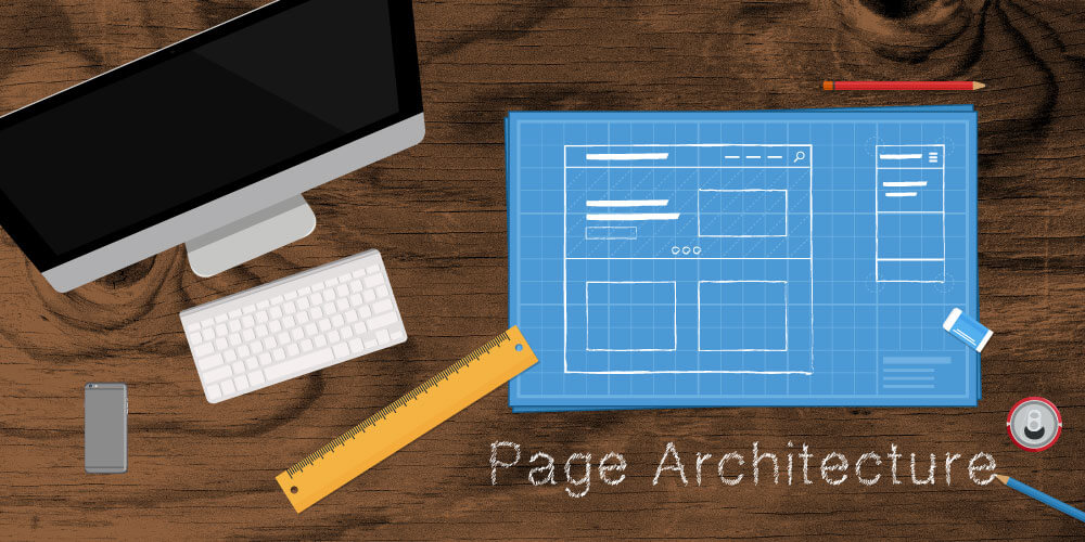
From there, think about the layout of the page. Page architecture is the support for what you want the content to say.
Using your Google Analytics and keyword research can also tell you what users are searching for and landing on, which can help you decide what content can live together and what might need its own page.
Subheads, Accordions and Tabs – Oh My!
Headings, subheadings, accordions and tabs are styled by your designer, so why not use them? Geonetric’s content experts offer guidelines for elements of page architecture:
- Subheads are best used when changing topic or voice. Subheads help ease the transition and summarize the paragraphs that follow, making it easy for a user to scan the page.
- Paragraphs should be kept relatively short for easy reading, perhaps three or four sentences. Large blocks of text can turn readers away, especially on mobile devices. Add variety to paragraphs of text by using bulleted lists to elaborate on conditions, treatments, symptoms and more.
- Accordions should be used when you have too much copy for a bulleted list, but not enough copy for a new page. They’re great for explaining a test or medical treatment. Generally, keep accordions light on a page. More than seven can look daunting to a user, especially on mobile devices.
- Tabs should be used when comparing information or providing chronological data. Ideally, stick to no more than five tabs on a page. And remember, some tabs can become accordions on mobile devices.
Point Your User in the Right Direction
Now that you gave your user such great information, what should he or she do next? Adding a call to action (or CTA) to the page should direct that user to the next action – make a call, send an e-mail, schedule an appointment, etc. A few helpful tips:
- Keep CTAs high on the page so they don’t get buried when the site displays on a mobile device.
- Make your CTAs stand out by placing them in callout boxes or panels.
- Don’t bury CTAs in accordions or tabs. Since those are user-triggered, there’s always a chance the reader won’t find them.
Page Architecture Matters, So Don’t Skimp
Avoid the temptation to just plop words on a page and hit “publish.” Page architecture might take extra time, but it’s time well spent. Sound page architecture and content results in not only a better user experience, but longer page-viewing duration, higher return visits and a higher likelihood of conversion.
If you need help planning and writing your site content, contact us to find out about our content strategy and development services. From strategy to in-depth writing and analysis, our team can help you share meaningful content with your target audiences.