

“Geonetric tested our old design and used the data, as well as industry best-practice recommendations, to provide a new, refreshed design and improved navigation experience to enhance our online experience for patients. It’s exciting to see how these changes have delivered impressive results in traffic to our key service lines.”
Christy Bock, Marketing Specialist
Mercy Medical Center
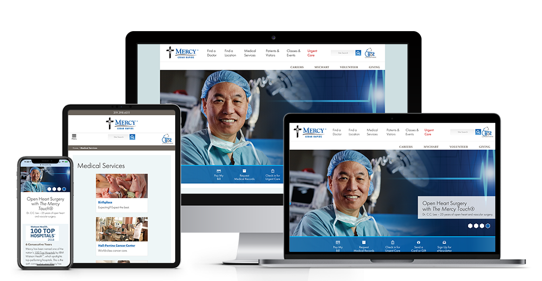
When Mercy Medical Center in Cedar Rapids, Iowa, approached its 2018 redesign, the team had strategic goals in mind for brand growth that tied in with the website:
- Support ongoing organizational growth
- Improve patient satisfaction and provider engagement
- Improve care navigation for several targeted service lines, including Cardiology, Pulmonology, Oncology, and Ear, Nose & Throat (ENT)
- Grow volume and market share in key service-line clinics, including Obstetrics, Cardiology, Surgery, Urgent Care, and more
- Increase the number of lives covered and touched by Mercy annually, including achieving 82% of patients seen by their primary care provider
- Connect and engage current and prospective patients
- Increase Foundation’s assets and endowments
- Promote new and existing services, especially the new advanced open-heart surgery
They also wanted to attract new employees who share Mercy’s values, especially nurses, as well as bolster opportunities for donations to their Foundation.
Goals and metrics from the get-go
To help establish a foundation of success for their new website redesign and launch, the Mercy team set benchmarks that aligned with key goals, including tracking current appointment requests, class registrations, job application submissions, and online donations.
Built on the same content management system as their old site, VitalSite the new site had new goals, particularly increasing web traffic and engagement from new site visitors as Mercy aimed to attract new patients to the hospital through urgent care visits.
Geonetric’s digital marketing team helped Mercy set up tracking of downloads, outbound link clicks, and email address click-throughs, making it easy to measure engagement across the site. Geonetric also provides quarterly analytics check-ins with the Mercy team so they get an even closer view, year-round, of the health of their website and marketing efforts.
UX testing and collaboration among digital experts
On the Geonetric side, content strategy, digital marketing, and design worked closely throughout the planning and design phases: Content strategy guided the site architecture and navigation experience, while digital marketing laid out important conversion points and goal tracking. Design helped bundle all the research and discovery together into a layout that speaks to new and existing patients and captures Mercy’s tagline, “The Mercy Touch®.”
But, most importantly, the pre-launch user testing and heat-map analysis revealed valuable information to both teams that drove redesign decisions. For example:
- Navigation: The main navigation testing revealed users primarily clicked on Find a Provider, Our Services, Patients & Visitors, or relied on site search. Less-used main navigation items were moved to lower-priority navigation in the redesign to ensure patients easily found the information most relevant to them. Users commented that “Our Services” was confusing if looking for medical services only, so this page was renamed “Medical Services” in the redesign for clarity.
- Drop-down Navigation: In addition to navigation label changes, comments from participants in the usability study indicated that not knowing what was included under each section made it difficult to choose. As a result, Geonetric and Mercy strategized drop-down navigation that provides some top-level pages of interest for patients, as well as interactive search fields for pages like Find a Doctor and Find a Location.
- Site Search: Data showed that users were relying on site search more than expected. Based on the terms searched, such as “medical records,” and “urgent care,” adjustments were made to the main and task navigation for visitors. For example, “urgent care” moved to the main navigation for easy access on all devices.
- Mobile: Mobile scroll maps revealed users stuck to the top of the site on the homepage, which helped designers consider the top-billing needs that required above-the-fold placement. However, internal pages had much more scroll interaction, making it easy to incorporate design elements to break up service-page text.
- Medical Services: The A-Z links on the services landing page was highly interactive for users. While the previous design featured eight primary services before the A-Z list, the new design spotlights only six, making it easier for users to reach the A-Z links quickly.
Positive results post-launch
If more traffic, engagement, and interest from patients was the goal of the redesign, Mercy’s team has much to celebrate:
- Post-launch, bounce rates decreased by 10% and session duration and pages per session increased.
- By moving urgent care to the main navigation (including added emphasis with a pop of color in red), views of the page about MercyCare Urgent Care’s eArrival service nearly tripled in the three months immediately after launch compared to the same three-month period the previous year. The urgent care check-in tool, eArrival, also saw more engagement. Urgent care location pages dominate the top locations list, too.
- Medical services, as a whole, had a 101% direct traffic increase and a 3% organic traffic increase.
- Entrances to Find a Doctor increased by 10%.
- To give better visibility and structure to search engine indexing and the A-Z service links, Geonetric recommended moving bariatric surgery to its own section, away from the surgery service line. The result? A 15% increase in traffic to bariatric surgery’s landing page.
- Provider profiles are enjoying a 10% increase in traffic, while heart — which has a new open-heart surgery to promote — has seen substantial growth of 132% in sessions, aligning perfectly with Mercy’s goal for more visibility.
Conversions and completions also increased for the contact us, Birthplace tour request, and patient pre-registration forms. Most impressive, Mercy’s Hall-Perrine Cancer Center saw a 163% increase in 2018 as compared to its 2017 traffic numbers, making it one of the services with the largest digital growth for the organization.
And finally, after the launch, Mercy received a Best in Class Award from the 2018 Interactive Media Awards, giving the marketing team a feather in their cap for all of the hard work in the name of digital patient experience.
Website Redesign Drives Urgent Care Traffic