

“Our site design is exceptional!”
Dalene Schramm, Lead Digital Coordinator
Avera
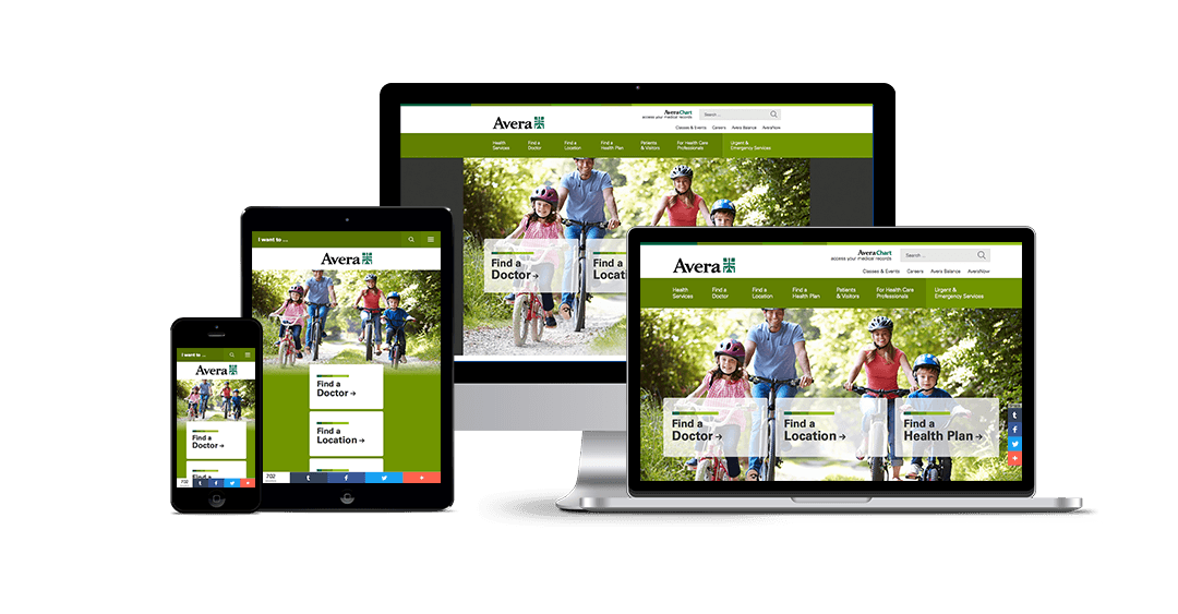
Guided by the values of stewardship, compassion and hospitality, Avera aims to improve the lives of the nearly 1 million people it serves across the Upper Midwest. In support of that mission, the organization pursued a responsive redesign to make it easier for users—especially the growing share of mobile visitors—to learn about and access care online. The redesign also meant merging Avera’s mobile site with the main site, resulting in less maintenance for the organization.
Benefiting Users & Stakeholders
For Avera’s first site overhaul in five years, Geonetric interviewed client stakeholders, who wanted an intuitive, clean, modern look that could “wow” younger audiences and new families while promoting providers, services, and locations. Website users shared input, too. Eighty percent of those who took a survey rated their online experience as good or better, but some reported leaving the website with tasks unfinished. Their top tasks, according to survey results? Finding contact information, paying a bill, searching for jobs and looking for services offered. The redesigned site had to make it as simple as possible for users to quickly accomplish such goals.

Getting it Done
To that end, the new homepage features a prominent task navigation that lets users make just a single click to get to pages about billing, careers, and other commonly-sought topics. On interior pages, the task menu floats to the top in mobile view and to the side on desktop so it’s unobtrusive but still easy to access. Links can change, if needed, as Avera gets user feedback or sees a need for shortcuts to certain activities.
Outside the task navigation, card elements invite homepage visitors to find a doctor, location, or health plan. On many pages, SmartPanels—a feature of Geonetric’s VitalSite CMS—dynamically display providers, events, and locations related to content visitors are viewing. This means that no matter where users are on the site, they’re often just a click away from all the information they need to visit an Avera physician or facility. That comes in especially handy for an organization with 330 locations and more than 1,600 providers.
For pages with a unique call to action, attention-getting CTA panels in bold green remain high on the page even in mobile view. That lets users quickly take the next step to engage with Avera—whether it’s registering for a birth center tour, donating online, contacting the organization, or doing something else.
Engaging Baby Photo Gallery
Geonetric’s designers developed an eye-catching online nursery to help users accomplish another of their top tasks—viewing baby photos. Proud parents can announce their infant’s arrival, and visitors can quickly find their new little one by choosing a variety of helpful filters, including names, date of birth, gender, and hospital. The interactive gallery promotes Avera’s pregnancy and birth service line while keeping site visitors engaged.

Redesign Makes Site More Accessible