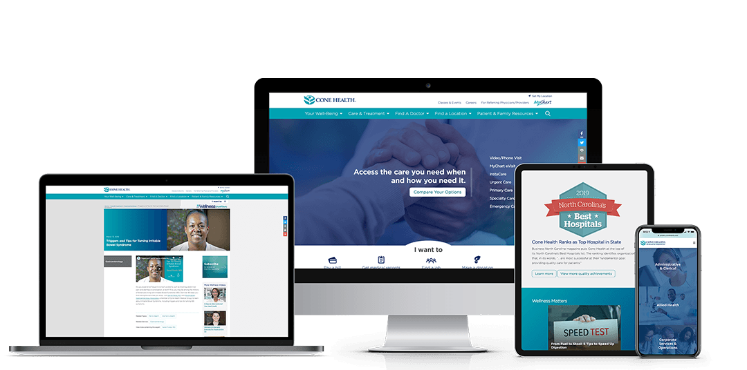


| Connecting health care and well-being is important to Cone Health, an integrated health system in central North Carolina. They’re dedicated to helping consumers access the right care, in the right place, at the right time — through both traditional and nontraditional services. When they set out to redesign their website with long-time partner Geonetric, one thing was clear: The new site had to help patients better understand and connect with options for in-person and virtual care. Aligning GoalsCone Health had recently updated its strategic plan as well as its brand promise, purpose, and vision. Its reimagined website needed to reflect, promote, and further those new goals and priorities. So they worked with content strategists at Geonetric to figure out how to align digital efforts with broader organizational initiatives. User Behavior AnalysisRemaining true to their patient-focused values, Cone Health invested in research to better understand how users interact with their website. Geonetric’s digital marketing, content, and design experts began by using heat mapping and web analytics to understand what existing content users engaged with and what they overlooked. Geonetric used that data, along with stakeholder feedback and industry knowledge, to recommend new information architecture (IA), homepage elements, and visual design. To learn whether the new IA and design would resonate with users, Geonetric and Cone Health ran usability tests. User TestingUsability tests revealed opportunities to strengthen the new site by making small adjustments to labels, page names, and design elements. For example, a page outlining quick-care options (such as urgent care, virtual care, and evisits) was originally labeled “Right Care, Right Place, Right Time.” Testing suggested that this label wasn’t clear to users, so the team renamed it; now the page title is “Compare Your Care Options.” Today, the page attracts significant traffic — views increased 112 percent year-over-year in the four months after launch. Strategic Use of Homepage SpaceThe Geonetric team worked closely with Cone Health to create a homepage that puts the “right care, right place, right time” concept front and center. Gone is the traditional rotating banner, which had little user engagement. Today, this valuable space helps users understand and connect with services such as urgent care, virtual care, and evisits. As users hover over each option, they see a brief explanation of the service and an arrow that invites them to click through for more details. When users aren’t engaging with the list of services, they see a call to action (CTA) to compare all options. This CTA takes them to the “Compare Your Care Options” overview page. The concept was well-received in usability testing. And, since the new site went live, the care options homepage element has seen steadily increasing engagement with thousands of clicks each month. Site visitors are using it to connect with all care options, but especially with newer services like evisits and video/phone visits. |
User Research Paves the Way to Highlight Access to Care During Redesign