

“We wanted a design that was outside of the box and Geonetric delivered. We love the video header, navigation, and the fact it’s responsive. From design to content strategy, Geonetric’s team really helped us streamline and improve the way we are presenting our organization online.”
Former Marketing Specialist
Owensboro Health
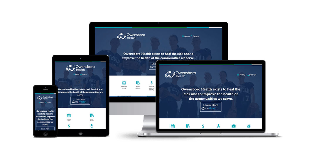
Owensboro Health, in Owensboro, KY, decided to take its site design in a new, bold direction. The site features an out-of-the-way hamburger menu for the navigation and unique, card-inspired design elements. The feature that steals the show is a large-format video in the background of the homepage that tells a story about the new hospital, quality healthcare, and community involvement.
Impressive Video Banner
The video on Owensboro Health’s homepage is the perfect way for the organization to present its brand, engage with visitors, and most importantly, tell its story of a comprehensive health system. With images of everything from the new building to Healthpark to babies, viewers truly get a sense that Owensboro Health has consumers covered for every stage of life.
Innovative Navigation
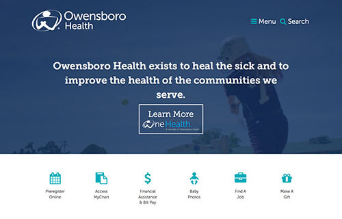
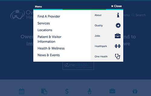
Building off of the popularity and familiarly of mobile menus, known as hamburger menus, Owensboro Health’s site features the hamburger menu on the desktop site. When a site visitor clicks, he or she sees a new fly-out menu with the full navigation. Keeping the menu behind the three stacked lines helps declutter the homepage while still offering lots of navigation options. The site also offers task-based navigation, presented with icons, in the middle of the homepage.
Streamlined Content to Eye-Catching Calls to Action
The health system partnered with Geonetric to extend the clean, uncluttered look and feel to the site’s copy as well. New, benefit-driven web copy engages site visitors and provides an overview of the health system’s comprehensive services. In addition, the design and content complement each other perfectly on the call to action (CTA) panels. Featuring an action-oriented green that stands out against Owensboro Health’s blue, the CTA panels encourage site visitors to take the next step and engage with the health system.
Pushing Healthcare Website Design