


User experience is a top priority for every healthcare marketer. Google Analytics (GA) is a top place to go to start your research as it provides data around what pages users are visiting. But, it lacks insight into how users actually engage with those pages. Seeing how your site visitors engage on a page can be extremely helpful in optimizing your site and bringing your GA data to life.
Seeing your site through the aides of heatmaps, scrollmaps, and clickmaps gives you the ability to be in the shoes of the users. These maps work similarly to an x-ray in that they give you an inside view of what is going on during a user’s visit. They allow you to sit in the user’s seat and understand what they experienced on your site. Let’s take a deeper look at each map type.
Heatmaps
Heatmaps are a visual understanding of where attention and focus are centered on a page. At a glance, you can better understand how the design of a page is either helping or hurting your conversions. It can be useful for A/B testing links when there is more than one link on a page that have the same landing page. In GA reporting, GA treats links to the same destination as the same link and displays only one data point. This makes it hard to decipher which of the links on the page received the most clicks. Using a heatmap will help you see what link received the most attention and had a higher click rate.

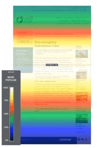
Scrollmaps
Scrollmaps show how far down on a page a user will scroll before losing interest. Any area highlighted blue on the page is being ignored by site visitors. They either scrolled past that section or exited the page entirely. If there are any important calls to action (CTAs) or content in those areas, they need to be moved to the sweet spot on the page. In this image, the sweet spot is the area between the two red bars and is where you would want to put your most pertinent information and CTAs. The white and red visual indicators illustrate where users spent time on page, and were marked as the more engaging parts of the page.
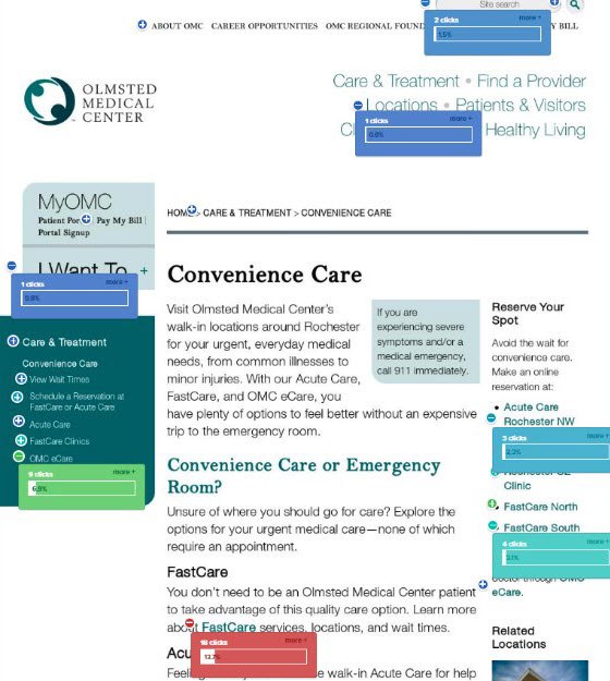
Clickmaps/Overlay
Clickmaps or the Overlay displays where users are clicking on a page and helps to determine if users are finding the content they were looking for. And, if your design placed that content appropriately. Blue indicates less clicks on the page and red indicates more clicks. You may find users are not registering for an event on a page they are visiting, but the button to sign up for an event is placed at the right side of the page where the heatmap indicates no one is spending time. Simply moving the button onto a left panel on the page may help to increase those conversions.
Helpful tools
There are several mapping tools available in the market. Below are three of the more popular tools marketers use to help evaluate their websites.
- Crazy Egg: One of the many tools our subject matter experts (SMEs) at Geonetric like to use to is Crazy Egg. Crazy Egg is one of the most popular heatmapping tools used by healthcare marketers today. Using the mapping tools explained, Crazy Egg gives you deeper insights into the behavior of your website visitors.
- Clicktale: In addition to heatmapping features, Clicktale allows you to play back a user’s browsing session using their Session Replays feature. Seeing how a visitor moves through your pages allows you to discover what caught their eye and led them to conversion on the page. You have the ability to watch multiple session recording of a particular page or follow a unique visitor’s session from start to finish.
- Lucky Orange: Lucky Orange allows you to watch in real-time what users are doing on a page. From toggling menus, opening popups, to moving through the completion of a form, you can co-browse with the user. They provide this data in Realtime Dashboards and Realtime Visitor Maps.
Get the complete picture
Using the information gathered from these three maps together, along with the data you’re uncovering from GA, gives you a complete picture and better understanding of your site visitors. It will confirm where users are looking on a page, whether they are reading the page or simply scrolling through, and how interested they are in your CTA offered. Knowing these answers allows you to make changes to your site that will only improve their user experience on their next visit to your site.
To find out even more information on how to use mapping tools along with GA tools to improve your healthcare website’s user experience, listen to our webinar!