Content Hub Focuses on Wellness

An investment in a new content marketing hub met two goals for Cone Health, an integrated not-for-profit health network headquartered in Greensboro, NC. First, the organization knew they needed to find a way to increase engagement with the community beyond the moment they needed care. Second, they wanted to invest more in content marketing and improve their ability to create content once and publish everywhere. Their new content marketing hub, Wellness Matters, makes both goals a reality.

Build on the Right Platform

Before Wellness Matters, Cone Health had been producing content, but without an overarching strategy. Content previously lived on both their main website and on a different blogging platform. By partnering with their digital agency, Geonetric, the Cone Health team decided to move all the content into their main website and into the VitalSite content management system. This helped connect hub content and service line content, and had the potential for increased SEO benefits since high quality, original content would be tied to the conehealth.com domain.

Develop a Thoughtful Content Strategy

VitalSite comes equipped with sophisticated taxonomy structures, and Cone Health worked with the Geonetric content strategy team to develop an advanced strategy to tag content in a way that ensures all items display appropriately.

To develop these tags, our team reviewed their service lines and editorial calendar, comparing that data with Google Analytics traffic. From this research, we recommended adding high-traffic topics such as parenting, diet and exercise, and heart health. With this foundation laid out, visitors can easily search the content hub by keyword, or filter by content type (such as article, infographic, patient story, video, etc.), or sort by topic.

In addition, Geonetric’s experts provided a one-day content marketing training to the Cone Health team, sharing insights on how people consume information online, the value of different types of content formats, tips for generating ideas, and writing best practices.

Engage Site Visitors with Design

The Wellness Matters design is engaging, with card-inspired images that have interactive roll-over effects as a user moves the mouse across the content articles. An eye-catching panel that promotes the all-important call-to-action – asking site visitors to subscribe to Cone Health’s monthly newsletter. VitalSite’s SmartPanels dynamically pull in events from Cone Health’s online calendar and events module, and additional panels display feeds from Facebook and Instagram. All together, the home page brings Cone Health’s different content forms to life.

Articles appear on interior page templates that match the main site and the medical group site, giving Cone Health a place to cross-promote related services. At the end of each article, readers are presented with related topics, services, and the option to read additional content by the same expert.

Get Noticed by Site Visitors and Competition Judges

In just the last six months, the hub has had more than 23,000 unique page views. It’s an important vehicle to connect site visitors to other key areas of the site driving traffic to the newsletter subscription page as well as to events and find a doctor.

In addition, Wellness Matters was recognized for outstanding achievement in the concept, design, and production of a medical website, receiving a Gold in the 2017 MarCom competition sponsored and judged by the Association of Marketing and Communication Professionals.

Website Redesign Connects Community Hospital with Consumers

Like many community healthcare organizations, Sturdy Memorial Hospital’s website was ready for a refresh. The organization knew they were seeing more visitors from mobile devices and they wanted to give all users an exceptional online experience.

That, combined with the fact providers were noticing they weren’t showing up in Google searches, made it clear the time was right to invest in their digital presence.

When the Sturdy Memorial marketing team began looking for a new vendor, they knew they wanted to work with someone who offered a CMS platform that would give control of the site back to the team. They found the right platform, and the right partner, with Geonetric.

VitalSite CMS Offers Needed Functionality and Ease of Use

Knowing how hard it was to update their previous site, ensuring their next CMS was easy to use was a top priority for the Sturdy Memorial team. With the help of their new partner, the team decided to build their new site on the VitalSite CMS platform.

For Sturdy Memorial, VitalSite offers enhanced functionality, including a provider directory with enhanced provider profiles, a services directory with an A-Z listing, a robust calendar and events directory, and a location directory that allowed the hospital and their many medical associates a place to tell their story. Since their redesign strategy included consolidating more than 20 microsites into the new, main system site, having dedicated places for location and service line content was key.

Another important feature VitalSite delivered to the Sturdy Memorial strategy was the ability to dynamically link information from all the directories throughout the site. This aided the organization’s move to be patient-centric, so now as a site visitor searched for information, they would automatically be presented with related content. For example, patients seeking information about heart and vascular care can also see related locations, related providers, related events, and related news alongside the service line content.

Best of all, this improved functionality didn’t mean the team had to sacrifice ease of use. This gives control of the site back to the Sturdy Memorial team, so they can easily add or remove pages, images, content, locations, and providers as the organization grows and evolves.

An Improved Experience from Design to Content

The enchantments didn’t stop with the new CMS and functionality.

The site also has a fresh, responsive design featuring improved patient-centric imagery and eye-catching calls-to-action. The rotating banner allows the team to feature different services, providers, or locations as well as the opportunity to coordinate with offline campaigns when needed.

A solid content strategy and new information architecture improved labels across the site’s navigation, making it easy for visitors to find what they need. The prominent main navigation covers the scope of information offered on the site that pertains to health consumers. Secondary navigation covers secondary audiences, such as job seekers and volunteers, and the task navigation offers a quick way for all visitors to find an urgent care center, make a donation, or access the patient portal.

In addition, the Sturdy Memorial team invested in improving service line content across the site, following best practices shared by Geonetric. With a detailed content matrix in hand guiding recommendations to improve content for users and search engines, the Sturdy Memorial team revised and wrote fresh content throughout, as well as condensed duplicate content to create a better user experience.

Traffic Tells a Story of Success

Since launch in October of 2017, the Sturdy Memorial site is enjoying impressive results. Overall traffic has increased by 116%, mobile traffic has increased by 220%, and organic search traffic has increased by 199%.

Their priority service lines are seeing notable sessions, with primary care getting the most pageviews among the service lines. Most service lines had 80% of their pages view come from organic search users. In addition, the provider directory continuously brings in the most pageviews across the entire site, with 82% of that traffic coming from organic search users.

New Provider Directory Supports Custom Profiles, Reviews, and Engagement

Creating a responsive, user-friendly website was a critical first step.

But Bryan Health in Lincoln, NE knew if they wanted to meet their patients in the middle, the Bryan Health website needed to more efficiently connect (and convert) their patients’ online experiences with the doctors and providers they needed.

First Step: A New Web Presence

Like many evolving healthcare systems, Bryan Health focused their first effort on creating a user-first responsive website that met the expectations of their growing mobile audience.

They also wanted to provide a more intuitive, branded experience between their health system, Bryan College of Health Sciences, and Bryan LifePointe, their fitness center and spa.

Deb Boehle, marketing and media relations manager, and Jenny Sundberg, senior marketing specialist, accomplished all of their high-level redesign goals and launched the redesigned BryanHealth.org in 2015.

Next Priority: Interactive Provider Profiles

After Bryan Health started working with NRC Health for provider ratings, their marketing team knew it was time to share that transparency on their website.

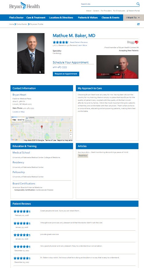
Their 2015 design launched an improved provider profile, including provider videos and an option to request an appointment. Because VitalSite Provider Directory already includes many fields for information most vital to prospective patients, Bryan Health just needed a strategy and method for putting all the pieces together. In 2016, the Bryan Health team integrated provider ratings and reviews to the profiles, too, all which are easily visible from the find-a-provider results page.

One-Stop Shop from Results

And VitalSite’s Provider Directory offered room for additional, high-priority information, including logo designations for employed physicians in Bryan Physician Network, Bryan Heart, Crete Area Medical Center, and Merrick Medical Center.

Users can even see who’s accepting new patients and options to meet the doctor through introductory videos before scheduling an appointment.

Bryan Health also used a tabbed approach to their Provider Directory results page, letting users toggle between Bryan Physician Group providers and Bryan Health Connect providers. Or, users can view all.

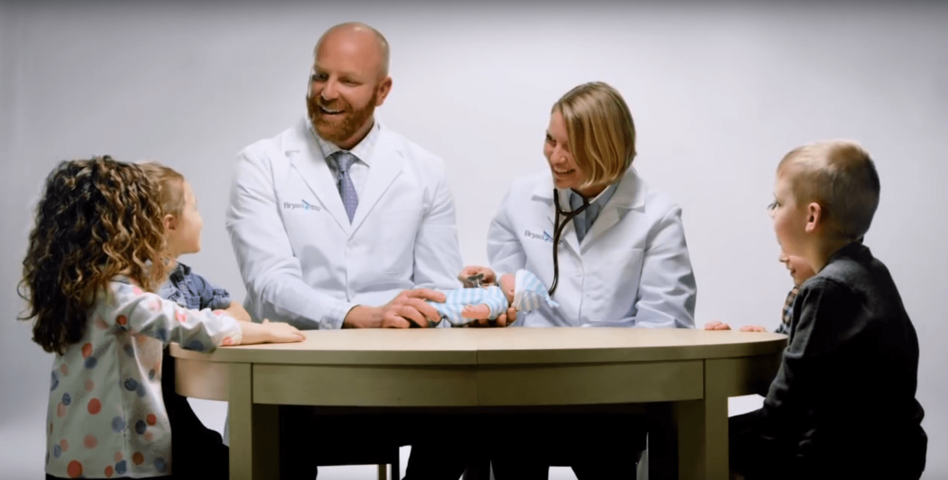
Even the landing page for the Find a Doctor page uses lightbox videos to introduce the physicians in cute videos where they’re introduced by children.

Visually Engaging Profiles

While the physician and provider profiles may vary, many Bryan Health doctors are showcasing engaging content that’s interesting to a discerning health consumer.

Articles they’ve written or appeared in, approach and philosophy of care, and educational background is readily available on most profiles, along with written reviews and star ratings from other patients, connected from NRC Health to the VitalSite CMS.

Dr. Mathue Baker physician profile
Above: Bryan Health’s Dr. Mathue Baker’s provider profile in VitalSite Provider Directory, with enhancements including ratings and reviews and a physician video.

Result: Increased Connection & Conversions with Patients

Since launching their enhanced provider profiles, Bryan Health has seen increased conversions with appointment requests, now available on applicable provider profiles. Users are also spending more time per profile-approximately 30 additional seconds on average.

Organic traffic, too, increased by nearly 40 percent. With the addition of Schema.org, Bryan Health has been able to better define what their pages are about, helping search engines to more easily connect patients and visitors to their content.

Like many directories on healthcare websites, the provider directory is integral to Bryan Health’s target audience. But by giving users what they need and providing access to take the next step, Bryan Health isn’t just highlighting their growing staff of providers, but bringing new faces through the door.

Streamlined Hospital Intranet Design Boosts Employee Engagement

When the Henry Mayo Newhall Hospital intranet—or HenryNET—management turned over from the I.T. team to the marketing team, it was clear that changes were necessary.

Initiating Change

An unintuitive navigation, broken links, and outdated content drove the need to develop a responsive and mobile-friendly intranet that could engage their employees and streamline processes.

The marketing team decided to configure HenryNET as a communication hub to cut back on manual email blasts and reliance on the shared drive. But they didn’t stop there.

They also wanted to get departments involved in owning and managing their own content. And, they wanted to implement a better overall experience optimized for what employees need most.

To make all of these goals a reality, they enlisted Geonetric and our VitalSite content management system.

Engaging Employees as Stakeholders

Before rebuilding HenryNET, Patrick Moody, director of marketing and public relations at Henry Mayo, decided to ask their target audience (physicians, medical staff and employees) how they use the intranet today.

They used a survey to all employees as a starting point. With more than 300 responses, Patrick and his team could make well-informed, audience-requested decisions that would improve the overall user experience. They asked questions like:

  • Why do you visit HenryNET?
  • What tasks do you perform most often on HenryNET?
  • What do you like or dislike about using the intranet today?

The variety of answers helped shape priority navigation and content needs. It also helped set design standards for the homepage.

Conversion-inspiring Responsive Design

Many employees noted that the design on the old HenryNET felt stale and cluttered. Outdated graphics and “under construction” messages were taking up space and delivering little value. Likewise, the site wasn’t responsive and made it nearly impossible to use on mobile devices in the hospital.

Geonetric used the survey responses to create a streamlined, clean homepage that provided flexible content blocks, promotional banners, and quick access to the links most used by employees. A new site navigation prioritized the places employees say they visit most – Departments, Human Resources, and Education & Training. A new-and-improved quicklinks menu on the homepage prioritized top-trafficked tools and resources employees use most.

Another important feature is the site’s new search functionality. Employees made it clear in the sure survey site search was an important feature that was missing on the last site.

VitalSite’s modules, like News and Calendar & Events, gave the marketing team new opportunities to share content and cut down on the overwhelming email blasts. To encourage employee interaction, they also introduced features like Ask the CEO, featuring Henry Mayo CEO Roger Seaver.

The Henry Mayo Newhall team also took the opportunity during the redesign to brand HenryNET, giving the intranet its own logo.

A Team Approach to Content Governance

Since Patrick and his team didn’t have the bandwidth to be responsible for every department’s content, they got other groups involved early, even including them in the training offered by Geonetric. Departments that previously had little or no content were even encouraged to consider what they’d like on the new intranet, giving them more pride and ownership to the new content and intranet.

Once HenryNET was in a good place, the marketing team did a soft internal launch 20 weeks after the project kickoff. The soft launch allowed key stakeholders to provide feedback before the official launch in November 2017.

Improved Experience: Positive Results

While the previous HenryNET didn’t have tracking like Google Analytics, the new HenryNET does, allowing the marketing team to see what content is driving interest from their employees and staff.

Today, their users are more engaged and enjoying new functionality and directories that weren’t there before, like the internal site search, Recent News, and Calendar of Events. The quicklinks menu on the homepage is one of the most easy-to-access and popular features on the hompage.

The department directory is one of the most popular destinations, with users easily accessing an A-Z list of hospital departments, contact information, and content pages. And more than 77 percent of their users are returning regularly, with users spending just under five minutes per session, on average.

Health Center Increases Appointment Openings to Accommodate PPC Success

Pella Regional Health Center launched a lung cancer screening, and the marketing team needed to generate appointments. They partnered with our digital marketing team for a five-month PPC campaign.

Conceive

We started with a kickoff call to discuss their goals and set the campaign strategy. The lung screening is a differentiator for Pella Regional because it’s offered by only a few other hospitals in the area. The target audience for the screening is people between age 55 and 80 who lived within driving distance. To reach their audience online, we chose to use display ads on Google and text ads on Google and Bing.

Develop

For the text ads, we developed user-focused copy that highlighted the benefits of the screening. We wrote some ads as a statement and others as a question to test which would perform better. We also added Google Ad extensions, including a call extension, location extension, and a few callout extensions.

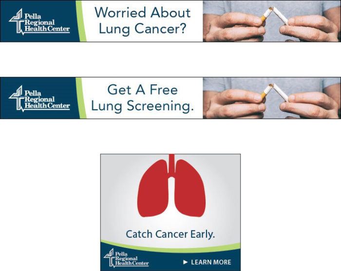
For the display ads, we created two concepts. The first was a real-life picture targeted to current or former smokers. The other ad was an animated GIF, showing a pair of lungs expanding and contracting.

Three of the display ads from the campaign. The top one says, "Worried About Lung Cancer?" and has the Pella Regional logo with the image of someone breaking a cigarette. The middle ad looks the same except the copy is, "Get A Free Lung Screening." The bottom ad has the Pella Regional logo, a picture of lungs, and says "Catch Cancer Early" with a CTA that says "Learn More."

Implement

We implemented text ads on Google and Bing. We also launched display ads through Google AdWords.

Analyze

Our team used heat mapping to track the success of the landing page. Throughout the campaign, we saw they were getting more mobile visitors, but the CTA was appearing at the bottom of the page in mobile phones. We recommended moving the CTA to the top to capture more conversions.

Test

For the display ads, we tested the picture of a man breaking a cigarette against the GIF of lungs expanding and contracting. The picture was more successful, bringing in more clicks.

For text ads, we found that questions were most successful in both Google and Bing. Over the course of the campaign, we transitioned to using more questions in the ad copy.

Conclusion

Within the first couple of months, Pella Regional got more appointment requests than appointment openings. To accommodate the requests, they performed screenings an additional day each week. And we achieved these results while keeping the ad spend below the monthly campaign budget.

In addition to exceeding the main goal, the campaign helped increase the brand awareness by creating over one million ad impressions in the last month alone. The medical imaging team was pleased with the results, which led to more follow-up appointments with Pella Regional’s pulmonologist for abnormal screenings.

PPC Campaign Attracts New Patients

Concord Hospital’s Center for Urologic Care ranks in the top seven percent nationwide in patient satisfaction surveys (Press Ganey). With scores like that, Concord Hospital’s marketing team wanted to spread the word. They partnered with Geonetric to reach health consumers in Concord, NH and the surrounding areas with a three-month PPC campaign.

The campaign focused on growing service line volume and increasing visibility outside their primary service area. To achieve their goals, our team worked through our five-step process for PPC campaigns: conceive, develop, implement, analyze, and test.

Conceive

We began by learning about Concord Hospital’s urology services, specialized programs, and the benefits to patients. After we understood Concord Hospital’s services, we imagined the types of people affected by different conditions—their age, gender, and topics that interest them. The campaign focused on conditions including:

  • Enlarged prostate
  • Prostate cancer
  • Erectile dysfunction
  • Incontinence
  • Kidney stones
  • Pelvic pain

We conducted keyword research for each condition. Our team searched for keywords that had high traffic and provided good value.

In addition to the PPC work, we talked with Concord Hospital’s marketing team about the conversion journey to provide a larger context for the campaign and recommend best-practices. We discussed the importance of making each step easy for potential patients and provided advice on which landing pages to set up for the ads. These discussions helped establish a consistent user experience throughout the conversion journey, from seeing the PPC ad to requesting an appointment.

Develop

The keyword research informed the development of text ads in Google and Bing. Our team focused the ad copy on patients’ needs and highlighted the benefits of the Center for Urologic Care.

In addition, we used dynamic keyword insertion to personalize the ads. By including brackets { } in the text ads, Google and Bing pull the keyword that triggered the ad. While we control which keywords can appear through a target keyword list, it adds a personal touch that makes the ads more relevant to users.

We also developed display ads, working collaboratively with Concord Hospital’s team to choose the right images and copy.

Implement

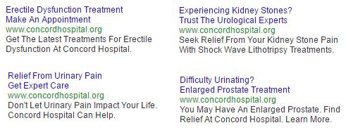
We implemented text ads on Google and Bing. We also launched display ads on Twitter, Facebook, and Google (see examples).

Four text ads used in the urology campaign. The top left one says: "Erectile Dysfunction Treatment. Make An Appointment. www.concordhospital.org. Get The Latest Treatments For Erectile Dysfunction At Concord Hospital." The top right one says: "Experiencing Kidney Stones? Trust The Urological Experts. www.concordhospital.org. Seek Relief From Your Kidney Stone Pain With Shock Wave Lithotripsy Treatments." The bottom left one says: ""Relief From Urinary Pain. Get Expert Care. www.concordhospital.org. Don't Let Urinary Pain Impact Your Life. Concord Hospital Can Help." The bottom right one says: "Difficulty Urinating? Enlarged Prostate Treatment www.concordhospital.org. You May Have An Enlarged Prostate. Find Relief At Concord Hospital. Learn More."

Two display ads used in the urology campaign. The left one has a picture of a middle-age woman and says, "Have Pelvic Pain? Make An Appointment Today." The right has a picture of an elderly woman. The caption says, "Take Back Your Life. Seek Bladder Control Care Today." Both display ads have a banner at the bottom with the Concord Hospital logo and the text "Learn More."

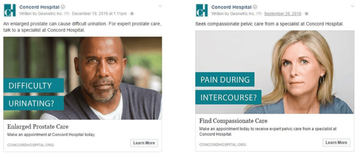
Two Facebook ads used in the urology campaign. The left one says "An enlarged prostate can cause difficult urination. For expert prostate care, talk to a specialist at Concord Hospital." Then there's an image of a man with the caption, "Difficulty Urinating?" The right one says, "Seek compassionate pelvic care from a specialist at Concord Hospital." There's an image of a woman with a caption that says, "Pain during intercourse?"

Analyze

After the launch, we began analyzing the data. We monitored traffic and conversions generated by the ads. Our team reviewed the campaign’s performance on an ongoing basis and optimized targeting and budget for the keywords, ads, and platforms that performed best. For example, we paid attention to the keywords that got better results, such as “Erectile Dysfunction” or “E.D.”

While we made small adjustments throughout the entire campaign, we made major recommendations in monthly meetings where we delivered a monthly performance report. Major changes included shifts in platforms and changes to the ads themselves.

Platform Shifts

From the beginning, we identified Twitter as the lowest performing platform. The click-through-rate (CTR) was low for industry averages. For the people who did convert, they spent very little time on the landing page. After a month, we ended the Twitter ads and shifted the ad spend to Facebook, which was performing well.

While Google performed well in the beginning, Bing improved over time. By the end of the second month, we decided to shift some ad spend from Google to Bing to increase ROI.

Ad Changes

In addition to monitoring the general performance on each platform, we examined the performance of individual ads and ad groups. For example, between months two and three, we made enhancements to the kidney stone text ads to optimize the keywords. We also made changes to display ads, such as swapping genders in some images and improving the ad copy (see examples).


This is the original display ad. It has Concord Hospital's logo on the left. The caption says, "Have kidney stones? Talk To A Specialist." On the right, there's a picture of a woman.
Before
This is the original display ad. It has Concord Hospital's logo on the left. The caption says, "Kidney stone pain? Make An Appointment." On the right, there's a picture of a man.
After

Test

We tested the results of each change we made. Here’s some highlights:

  • The decision to end Twitter ads and move that ad spend to Facebook paid off. In the remaining months, Facebook’s CTR was three times higher at 2.99 percent, with the cost-per-click being almost half as much. By making the switch, Concord Hospital increased traffic at a lower cost.
  • While Google outperformed Bing in the first month in CTR and number of clicks, Bing surpassed Google in the last month. While the CTR was about equal, Bing brought in over twice the traffic with a cost-per-click that was 27 percent lower. Bing reached the right people, which helped increase traffic and appointment requests.
  • By optimizing the copy for the kidney stone text ad group, the CTR doubled. Swapping the image for the kidney stone display ad improved number of clicks and average CTR.

Conclusion

The campaign ran for three months. The ads drove 9,570 visits to their site, and resulted in 17 appointment requests. The ads raised awareness for the Center for Urologic Care and generated new revenue.

Content Marketing Hub Connects with Community

Avera, based in Sioux Falls, SD, knows that effective content marketing builds trust and attracts new patients. The organization has been investing in content marketing efforts for years, starting with their popular WordPress blog, Avera Story Center. Although the blog was popular, the content was location-focused and didn’t reflect the fact Avera had moved to a system-centric marketing approach.

In addition to the rebrand, the Avera team wanted to be more thoughtful in the way they used content marketing to engage with women in the community, and they knew there was an opportunity to build more efficiency into their efforts by repurposing content across channels.

The organization created a content marketing initiative called Avera Balance, with the goal of engaging women in meaningful ways with valuable health information. The initiative has three main components including a print magazine that is distributed once a year, ongoing email marketing, and an online content marketing hub that replaces Avera Story Center. Avera turned to Geonetric’s content strategy and design experts to bring the online Avera Balance hub to life.

Building a Content Machine

During the redesign of the main health system site in 2016, the Avera team worked diligently to reduce the number of pages and streamline the user experience. The team knew if they were going to increase page count on the site with blog-style content that it should be done strategically. They needed to create actionable content that users really wanted, written in a compelling and shareable way.

Geonetric’s content strategy team trained the Avera writing team on how to write for content marketing, keeping the user in mind and connecting the content back to a service line or a product they deliver, such as a support group or health evaluation. We also discussed how to repurpose content effectively, including how to take a media release and revamp it for other platforms and audiences. The training also covered how the tone and voice of content marketing differ from other types of marketing writing.

As part of launching the Avera Balance initiative, Avera also developed a new editorial calendar. The marketing team needed a resource to help them see what content could be repurposed, and where they had content gaps. Their new content calendar is a valuable resource that allows them to track all content in one place – including Balance stories, media stories, social media, and videos they produce with their local news channel.

With Avera Story Center, the writing team was posting 3-4 stories a month. With Avera Balance, the same team is posting new or repurposed content almost every day.

An Integrated Content Marketing Strategy

When the Avera team began to consider how to develop their new content marketing hub, they had more than one option. They could rebuild the hub on a separate platform like WordPress, but this would send traffic to a separate site. Or, they could build the blog in their current CMS, VitalSite.

Avera chose the second option because it prioritized the connection between service line marketing and content marketing. With content now organized around service lines and topics, the new Balance hub offers an improved user experience, while social and promoted traffic stays on the main Avera site. This option also has the potential for SEO benefits, as search engines send traffic to a single site that has quality content, which in turn, continues to strengthen the avera.org domain authority.

Powerful Functionality, Engaging Design

The new Avera Balance hub allows site visitors to easily search by keyword or filter content by topic or service, thanks to VitalSite’s sophisticated taxonomy system. Geonetric’s content strategy team guided Avera on how to appropriately tag all content –by service and topic, author, and format – such as text, audio, or image – to make the filtering possible.

The content strategy team also identified multiple cross-promotion opportunities, helping to integrate the content marketing content and website content more effectively. In fact, provider profiles automatically pull in Avera Balance stories based on the author taxonomy.

The design complements the Avera Balance print magazine and offers a Pinterest-inspired look with engaging photos, captivating headlines, and social sharing features that encourage users to share stories organically through Facebook, Pinterest, and LinkedIn.

An eye-catching call to action—placed front and center on both the Avera Balance home page and on individual posts—encourages site visitors to subscribe to the wellness enewsletter.

The health system unveiled Avera Balance to the community on Mother’s Day 2017, with both the Avera Balance magazine and the online marketing hub available for audiences to enjoy. In the 30 days after launch, the hub had 25,315 page views and 261 enewsletter sign ups. Digital marketing and social posts were able to drive more people than ever to the site, which helped to send engaged consumer to the hub.

In addition, the content has caught the eye of more than just community members. In the summer of 2017, NBC called to do a feature based on one of the Balance articles. The news outlet spent two days shooting the story last July, and the feature ran under the title “Finding the Right Medication: Gene Test May Help Treat Depression.” Almost a year later, Avera still receives several calls a week from people who want to travel to South Dakota to receive genetic testing.

Microsite Shares Patient Stories

After redesigning their main site, Bronson wanted to take the next step in their digital strategy. Bronson had been collecting testimonials, but needed a way to present them in a unique environment under the Bronson Positivity brand. In addition, Bronson wanted to develop a simple way for new and returning patients to submit their stories.

Collaboration Creates an Engaging Microsite

We collaborated with Bronson’s team and their agency, Periscope, to create a microsite called Bronson Positivity. Periscope created the design comps, and we translated them into design templates for WordPress. The result: a responsive site that engages site visitors and showcases patient stories.

Visitors can filter testimonials by location and service, thanks to the tagging features in WordPress. A card-based design supports an intuitive filtering experience. The site also allows visitors to search by keyword to easily find stories that speak to them.

Functionality Enables Strategic Integrations

Bronson promotes the testimonials on their main site by using a custom API our team developed. The API connects Bronson’s main CMS, VitalSite, and WordPress, allowing for testimonials to be dynamically integrated with existing provider, location, and service line pages. Prospective patients value and enjoy learning more about what their experience at Bronson will be like based on the authentic stories of other patients.

On the Bronson Positivity microsite, testimonials include links to related doctors, services, locations, and classes and events on the main site when applicable. For example, visitors reading a testimonial from a surgery patient can easily learn more about Bronson’s expert surgeons and related services.

Icons at the bottom of the page allow users to find related doctors, services, locations, and classes

Testimonials Offer a Multimedia Experience

The website includes a custom form for patients to easily add their testimonials and include images and videos. Calls-to-action on the home page and at the end of each testimonial encourage visitors to submit their story.

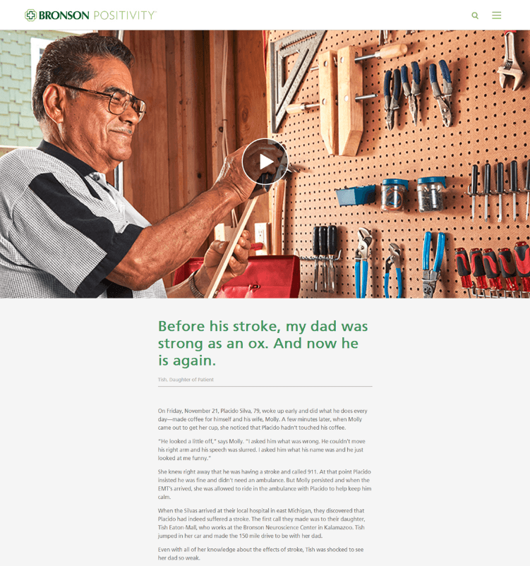
A screenshot of a testimonial with a video banner

Conclusion

The microsite has successfully integrated patient testimonials into Bronson’s digital strategy. By empowering patients to share their own stories, Bronson’s team is able to present a genuine and timely view of the patient experience. In the 18 months after launch, Bronson received 280 form submissions of testimonials. It’s such a streamlined process that Bronson’s team now has a little more time to pursue the next big thing.

Going Beyond Project-Based SEO

Owensboro Health is a regional health system serving 14 counties throughout western Kentucky and southwest Indiana. With multiple competitors in the region, SEO is important for attracting new patients online.

But Owensboro Health’s team wasn’t just looking for a quick fix. They wanted long-term success. They understood that effective SEO depends on a number of factors — from the technical foundation of their CMS to their competitors’ service line strategy — and the only way an agency can gain a holistic understanding of those factors is through a long-term partnership.

Combining research with projects

Owensboro Health engaged in an SEO retainer that combined research with project work. Our team conducted research that identified opportunities to improve. Research included keyword reports, crawl reports, and analyses of competitors’ SEO and PPC performance.

The teams met regularly to discuss completed work, review results, and prioritize upcoming projects. The type of work varied, ranging from establishing redirects and adding metadata to reorganizing site sections and reshaping content.

In this case study, we’ll highlight two projects from the retainer.

1. Increasing traffic to provider profiles

Owensboro Health wanted to attract more people to their provider profiles. Based on our research, we decided to rewrite HTML page titles and meta descriptions as an initial SEO tactic for helping them achieve this goal. We optimized the HTML page titles to increase search engine rankings and focused the meta descriptions on convincing users to click through to the profiles.

Before the project, the HTML page titles listed the provider’s name and “Owensboro Health.” Our team added specialties and locations. We also properly formatted provider names and credentials to the way search engines prefer. The added information attracts visitors who are researching specialties and captures traffic from local searches.

The meta descriptions convey benefits from the patient’s perspective, and a clear call to action drives users to visit the profile. We also incorporated keywords to improve rankings.

In the five months after the project, organic unique pageviews increased 58% compared to the same period the previous year. Comparing the five months after the project to the previous five-month period, results showed:

  • 20% increase in mobile clicks from Google to provider profiles
  • 10% increase in overall provider profile impressions on Google
  • 7% increase in average mobile CTR to provider profiles
  • 16% increase in overall clicks from Google to provider profiles

2. Increasing traffic to Muhlenberg Community Hospital

Owensboro Health acquired Muhlenberg Community Hospital (MCH) the year before the SEO retainer. MCH had a small site, so initially, all site content was migrated to one page of Owensboro Health’s site and organized into accordion tabs.

The page attracted only a small number of visitors, most likely because Google’s algorithms give less weight to content hidden in tabs and accordions. Our team decided to build out the section for MCH, taking the content out of the accordions and organizing it across 17 new pages.

The hub page includes general hospital information. Subpages address major service lines. In addition to placing the content, our team optimized it for keywords. This included reshaping page headers, body content, meta descriptions, and HTML page titles.

Although this project was completed just before the November and December holidays (which usually cause a dip in traffic on healthcare websites), the section attracted more unique visitors than the months before. Organic entrances to the section increased 1,400% in November–January as compared to September–November.

Metrics also show more engagement with the section. Average time on page increased by 35%, and the bounce rate decreased 20%.

Building success over time

As Owensboro Health continues to strengthen their regional presence, SEO is important for reaching health consumers online. The retainer allowed them to prioritize and tackle a wide variety of projects, attracting more potential patients to their website.

Provider Profiles that Engage Mobile Audiences

For most health systems, traffic to the website from mobile users is skyrocketing. Whittier, CA-based PIH Health is no different. In fact, 62% of all web traffic to the integrated delivery system comes from mobile. And the top visited section by mobile users? Find a Doctor.

That’s why PIH Health decided to revamp its provider directory. The organization wanted to ensure its most popular section presented well on mobile devices, engaged mobile users, and made it easy for all users to convert.

Building Impressive Profiles

Since PIH Health had recently undergone a merger and consolidated with a physician group, the organization now had more than 150 primary care physicians to promote. As they worked with their agency, Geonetric, to build a new provider directory, they also took the opportunity to update the provider profiles.

When writing the doctor bios, PIH Health kept the read in mind at all time. Health consumers do a lot of online research and want to learn about their potential physician’s education, specialties, and certifications. However, reading about a doctor’s family and hobbies can also influence selection. Knowing this, PIH Health created biographies that highlight clinical expertise and offers information that helps readers get a sense of the doctor’s personality. To humanize their doctors even more, PIH Health also invested in provider videos. Site visitors can now watch a doctor describe their practice philosophy.

Going Responsive

One of the main goals of PIH Health’s redesign was to go responsive and ensure the website and provider directory automatically adjusted to a wide range of devices. After researching their mobile users, they opted against placing an appointment request form on their provider profiles and instead placed a large phone number at the top. PIH Health knew their target audience found filling out forms on their phones cumbersome, so the phone number worked best.

PIH Health also took a mobile-first approach to profile layout. Using design elements, the profile is broken into sections, keeping important conversion information at the top, while providing new and different value as the user moves down the page. This layout also encourages mobile users to swipe and scroll to learn more.
Mobile users are engaging with the changes. Since launching the redesigned provider profiles, PIH Health has seen an 182% increase in physician profile page views. The Find a Doctor section of the website continues to be the most popular with the mobile audience and has brought in more than 30,000 page views in the first six months since launch. In addition, the doctor videos average more than 1,100 views per month.